We are delighted to receive the “Advanced Specialization: Identity and Access Management” status thanks to our consultancy and proven knowledge on identity and access management with Azure Active Directory allowing our customers to manage their access to IT systems more efficiently and more securely.
You can easily and interactively add your Power BI reports to SharePoint only using the Power BI report section of SharePoint Online. When using the “Add to SharePoint Online” option, the attached report complies with all project permissions and data security through row-level security (RLS), so you can easily create a secure internal portal.
Now ,with the last update released by the Power BI team, the action bar of Power BI reports are also included in SharePoint. Let’s see and analyze it together!
WHAT IS SHAREPOINT?
The SharePoint application is a data storage system developed by Microsoft. The system prevents data loss by enabling companies to copy their documents to cloud records. Microsoft Sharepoint makes data transfer between programs easier by collecting all documents prepared by Microsoft under a single roof. The SharePoint application supports the integration and transfer of data between all applications (such as OneDrive for Business and Microsoft Office). Also, its licensing is the same as the Microsoft Office application.
WHAT DOES SHAREPOINT DO?
You can use SharePoint to speed up document conversion in your workflow. Documents created and saved in Microsoft systems can be easily managed through SharePoint. The SharePoint application is used to make document management and data management easier by providing all data flows between Microsoft applications, document management, information transfer between systems, search options between archives, and various Excel services. When any change is made to the saved document, the data owner gets informed. SharePoint enables documents and information to be controlled with high-level security measures. It also enables the documents to be used together and to be easily accessed in all studies.
ADDING A POWER BI REPORT TO THE SHAREPOINT ONLINE PAGE
1. Go to Pages -> New -> Site Page to create a new site page in Sharepoint Online.
2. Click the button shown with (+) and choose the Microsoft Power BI add-in.
3. Select the Microsoft Power BI add-in.
4. Use the “Add Report” button to add our report to the SharePoint Online service.
5. On the right of the screen, we need to give the link address of the Power BI report that we want to add. Now, go to the Power BI Web service and copy the link address of the report we want to add. Today, I will use a sample report offered by the Power BI team.
6. Open the report on the Power BI Web service and copy the link address.
7. Paste the link address of the report into the Power BI report link box on the right. When you complete the process, you will see that the report you wanted to use is already on SharePoint Online. You can click ‘Publish’ to embed the report in SharePoint Online.
Now your report is on the SharePoint Online Service.
THE ACTION BAR OF THE POWER BI REPORTS IS NOW ON SHAREPOINT ONLINE!
Power BI has now included the action bar of the Power BI reports that we add to the SharePoint Online section with its brand new update. We can now use many features such as export, share, bookmarks that we have made in the report in the Power BI web service.
Do you use a stock report and are you in constant need of renewing the report and keeping up with it in order to not go stock out? Do you want to receive a notification immediately when one of the IOT devices you follow with Power BI reports get too hot? Then it is safe to say that data alert is your jam!
Data alerts is a feature exclusive to the cards on the Power BI dashboards. The values are checked for being over or below a certain level and if the limit is exceeded, then the person who created the data alert gets notified by Power BI regarding the situation.
Now, let’s take a look at how we can create one.
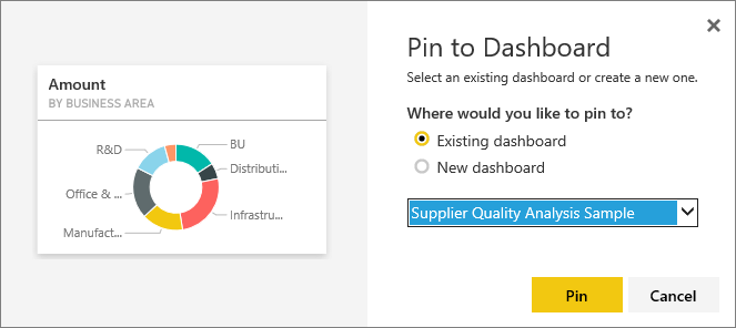
1- Pin the card to the dashboard
First thing first, we need to pin the card on the relevant report to the dashboard. As you know, we can make this card be shown on the dashboard we want by clicking the pin icon on the upper right of the cards.
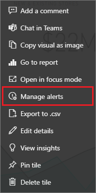
2 – Click “Manage Alerts”
Once we pin the card on our report to the dashboard, we will go to the relevant dashboard and click the ellipsis icon on the upper right of our card. Here, we choose the “Manage alerts” option.
3- Determine the Conditions for Data Alert
Now, we enter the information regarding the data alerts in the window that pops up on the right of the page. The title of the alert, our condition, if it will be over or below a certain value and that will this value be… You need to enter this value manually. Then, we will choose the frequency of this alert. And since we want to get an e-mail about the subject, we leave the mail option checked. Then, we “Save and Close”. This way, we get to complete the action.
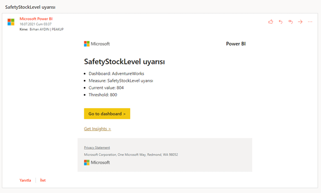
From now on, once all the data is updated an evaluation with the comparison to the determined value will be executed. And we will receive a notification when it is necessary. Here is an example of one of the e-mails:
Depending on the urgency of the situation, it is also possible to design different flows for when the e-mail arrives. We will talk about this in our other articles. You can take a look at the other articles here.
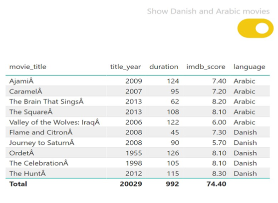
Hello dear reader! Today we bring you an important study topic that hasn’t been solved for the Power BI users yet. What if we want to subscribe to a hidden page in Power BI reports? What do we do? Actually, there was a poll in the community page for this feature to come and it has been approved, but hasn’t been added to the roadmap yet. With the “Hide Page” feature of Power BI, we can prefer not to show certain pages to some users in the reports uploaded to the portal. These pages usually consist of the detail pages. What is on these detail pages? The detail pages consist of very detailed information -usually charts- that we don’t directly need in the report but that is highly requested by some users.
And at some points, these hidden pages might be pages that have been directed from a navigation screen or it might be a completely unique situation to your company. Long story short, there are some pages and you do not want their name to appear or to be accessed directly by the users while browsing through the report! So what if you want to subscribe users to these pages that you do not want to be accessed directly in the report?
Power BI does not offer this as a default feature, meaning we cannot subscribe users to the hidden page. While researching the details of this, I found out that this is because of the design. After doing a few experiments on how to do this, we figured out how to subscribe to the hidden page in Power BI reports! If you please, let’s see how we can do it now:
1- Upload the said page to the portal without hiding it.
2-Define the necessary subscriptions to the page.
3- Click on “Edit Report” and hide the page.
Go back to the review mode and that’s it!
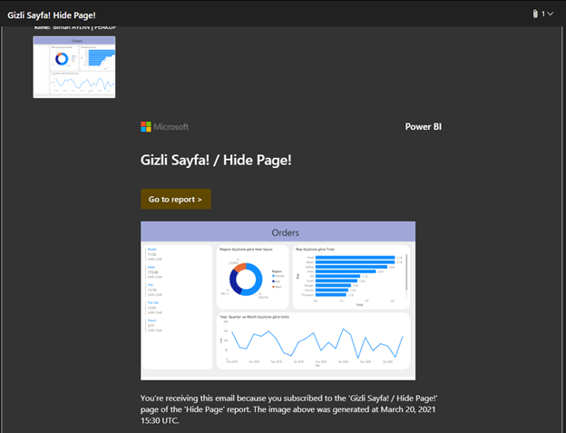
Now, let’s wait for out mail to come at the hour we have defined. Here it is!
It is quite simple to do, but there is a something that you need to pay attention to. Never turn on the subscription feature for the hidden page! When you turn it on, you will see that the report page field will be blank and this subscription will no longer work and you will need to repeat the steps above all over again. If you want to edit the subscription, first make the hidden page visible, then edit the subscription.
We can explain the reason of this situation like this: We had said that the report pages didn’t completely get lost in the back, and that were just not shown in the design on the front. So, actually, the information of the page is kept this way on the subscription page. However, when we turn the subscription back on, the values in this field start to work according to the current situation and explode when you cannot find the page! If you do not do such a thing, you can use this smoothly without any problems.
There is an increasing integration capacity among Microsoft products. We will start our article by talking about the integration between Power BI and OneNote. OneNote is a Microsoft product that has been released as a notebook and that has become more than a notebook with the updates it got. You can click here for general information about OneNote. You can get the text of an image with the updated (details here), and search between images (details here).
And Power BI is Microsoft’s popular reporting product. You can create interactive and impressive reports with Power BI. With the latest update, when you create a public Power BI report or come across one of those report and paste the report’s address to OneNote; OneNote automatically integrates with Power BI and show the interactive and live version of the report on itself. This way, it is not necessary for us to click the link and be directed to the website. And we don’t get to be left with the questions like which report was on this link.
Fig.1 – Copying the Power BI connection to OneNote
So, how do we make the reports made with Power BI public?
If you will not have any problems with sharing the reports you created with Power BI, you can make your reports public. After sharing, people don’t need to have Power BI license to view the report. It is enough for them to have the link.
Let’s take a look at how we create this link:
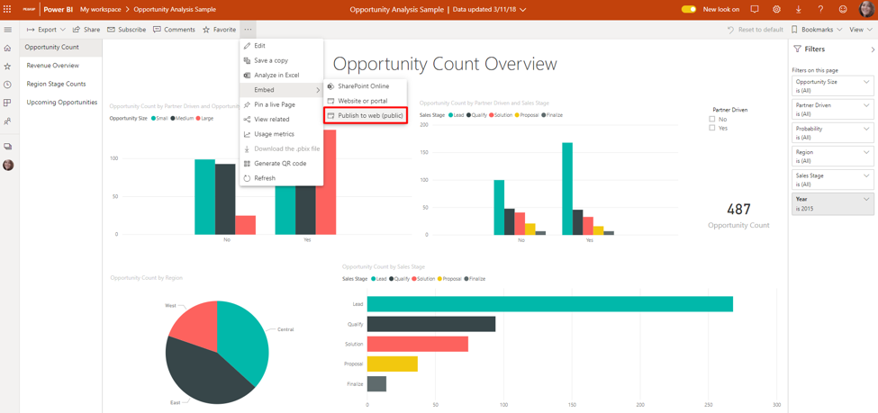
We will execute these actions on Power BI Web Portal ( app.powerbi.com). We don’t have to know with who and on which work environment this report will be shared in order to create the link. Open the report we want to share. Go to this option that was among “Export” options before through the “Embed” option on ellipsis. Click the “Publish to Web (Public)” command here.
Fig.2 – Access to the Publish to web command
You might come across two types of warning here:
1- Since this feature can be restricted on the Power BI Admin portal, it has to be enabled by your admin first. You might get an error message concerning this (Fig.3). If you get this error, you have to contact your admin and notify him/her.
Fig.3 – Contact your admin to enable embed code creation
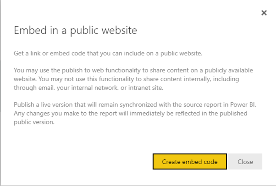
2- When you create this link, an info message indicating that this report and its content will be public and you shouldn’t use this feature is you will share it with certain people in the company will pop up (Fig.4).
Fig.4 – Create an embed code for public reports that you can include on a website
Click the “Create embed code” option to share your report publicly. When you click, another warning message pops up(Fig.5). Click “Publish” as your last decision.
Fig.5 – Information about you are creating a code for public website
After you click, a link where we can share on mail, social media etc. and people can access is created. Right below it you will find the html format to embed it on a website (Fig.6). This way, anyone who has the link will be able to view this report doesn’t matter if they have license or not.
Fig.6 – Link of the code
When you have multiple embed codes or want to delete a link, you need to click on the setting icon and then click the manage Embed codes option in order to go to the window where you can manage these codes. You can get the embed codes again or remove these codes on the screen that pops up.
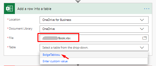
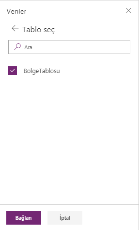
When you get data from Excel to products like Power Apps and Power BI, you need to use this data in the table format. If there is a table in the Excel from which you’ll get the data, it can be directly transferred to the system.
Even if the data is in an Excel on OneDrive, the situation is still the same. Data field should be formatted as Table.
Power Automate (MS Flow) – Excel Connection (OneDrive)
Power Apps – Excel Connection (OneDrive)
Using the Table Format
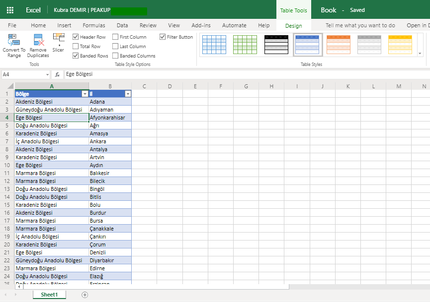
You can turn the existing data into a table by choosing Table in the Insert tab or in an Excel worksheet or you can start by inserting a new table. (The shortcut for creating a table in Excel is CTRL+L)
When you turn the data into a Table, it will be named as Table1. Every table you add to existing Excel will be named Table2, Table3 etc. When there are multiple tables, names are going to be confusing. In order not to be confused, you should rename all the tables in a meaningful way in Excel.
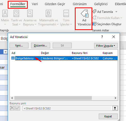
Defining Names
All table names in Power Apps data sources are displayed the way below and the same names are used in formulas. For this reason, the tables should be named before being connected to the platforms.
Excel Name Manager
View the existing tables from Formulas –>Name Manager. Click Edit–> Name and define and give a new name. The named table can be used in any platform that you want.
You can take a look at the details of creating and renaming a table.
You can click here to access the other Power Apps articles.
Hello dear reader! We only need to enjoy these warm days as the summer comes to an end they days become shorter, but isn’t it just WAY TOO HOT? With Power BI 2020 August updates, visualizations come to the forefront with the new images added to the marketplace. Apart from that, there are new collaborations with new resources and some additions to the existing features. You can download the update here.
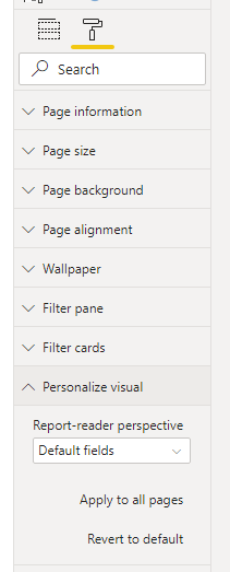
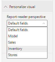
1-Perspectives support for Personalize visuals
As a refresher, Personalize visuals is a preview feature that will allow your end-users to make tweaks to visualizations in the reading view. For example, your end-user can change a measure or dimension or add a legend. Previously, if you had a large data model, there was no way to pick a more manageable subset fields to not overwhelm your report readers with all fields in the model. Now, in this release we are adding Perspectives support for Personalize visuals, which will allow you to choose a subset of a model that provides a more focused view.
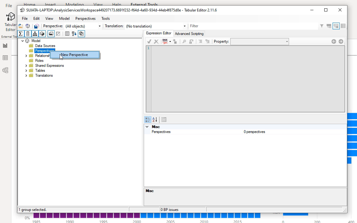
The hard thing is here for the user to make the correct decision. For this, we will use on of the tools developed for Power BI: Tabular Editor. As well as you can use these tools directly, you can already add them under a tab on Power BI Desktop. You can check the 3rd title here for more details.
You will need to right-click on Perspectives folder to create a new perspective:
Next, you will need to add fields to the perspective. You can do this by opening the Tables folder and right-clicking on the fields you want to show in the perspective:
Repeat this for all the fields you want to add to the perspective. Note that you can’t add duplicate fields to a perspective so if you already added it to a perspective you will see the option for that perspective is disabled.
After you have added all the fields be sure to save both in Tabular Editor and then also in Power BI.
2- Rectangular lasso select for data points
Another one of the Power BI August updates is the Rectangular lasso select. We were very happy about the rectangular lasso select. Now it is available for the data points in charts as well. You can select the point in the chart you want with CTRL and filter them. And you can add other points to the point you’ve selected with the Shift key.
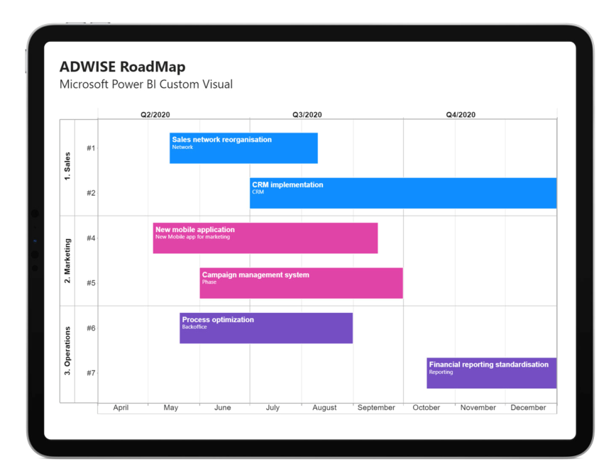
3- New Visualizations
Progress Bar
Pie & Donut Chart
Rating Visuals
Toggle Switch
RoadMap
4- Data Connectivity
Cherwell connector
CSM 10.0 enables real-time collaboration and accelerates incident resolution.
Automation Anywhere connector
Automation Anywhere is a leading Robotic Process Automation (RPA) platform that enables automation of Enterprise business processes. The Power BI connector from Automation Anywhere enables a business user to easily integrate RPA data in their corporate Power BI dashboards without relying on IT resources to create custom integration solutions. The Power BI connecter can retrieve operational, strategic and business metrics from Automation Anywhere’s RPA platform.
is an integrated platform for Data Warehouse Automation, Corporate Performance Management (CPM) and Financial Planning & Analytics (FP&A) for Microsoft Azure, Power BI and Excel.
It enables users to achieve results in minutes, and replace disparate legacy solutions with a single, cost effective and unified platform for all their analytics, planning, forecasting, consolidation and project planning requirements. With the new Acterys Power BI Connector users can now connect to their Acterys environment with one click (without the need to access the database directly or setting up a Power BI dataset) and add the required models to Power BI governed by their Acterys (Active Directory/ Microsoft Account) user rights and audit trails.
So much for this month’s updates. See you in our next article.
Hello, here we are with the Power BI March update! I realize how fast the months go by with the new updates. This month, we have some long-waited and nice updates. In this sense, Power BI users’ opinions were taken into consideration. If you have all buckled up, let’s start!
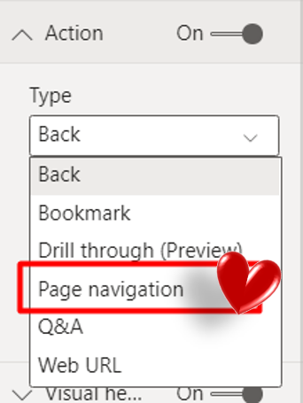
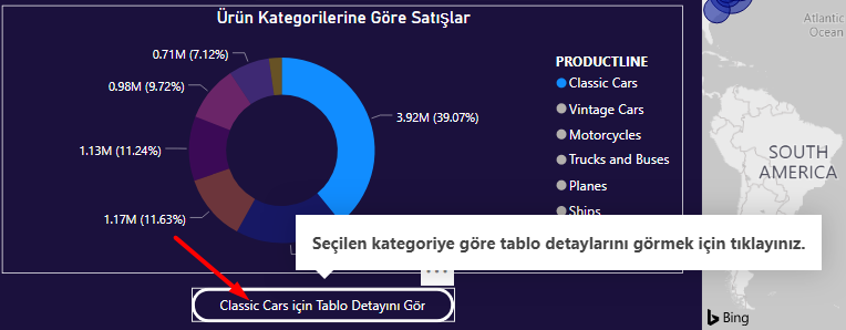
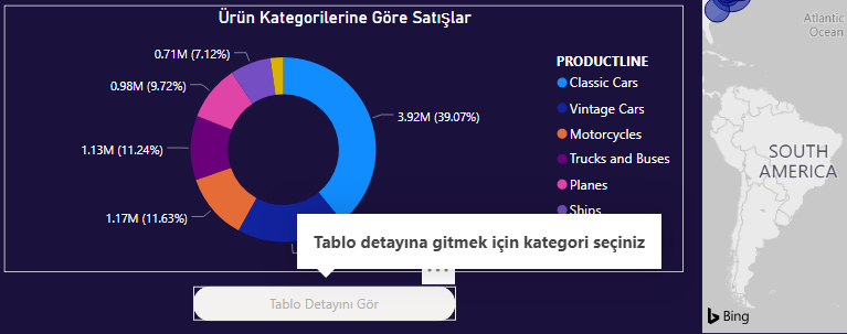
1- New Action Alert
The most eye-catching feature in the Power BI March updates! New action options are available for the buttons we add for more interaction and a better application image:
Page Navigation
Drill through
We tried to find our way with the Page Navigation action to this day: by adding a bookmark with the most unfiltered version of the other page. Microsoft found out that we solved it like the and stepped in and offered this as an action option to do this the legal way. I can spend all my applause on this feature.
Page navigation
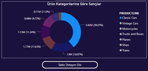
The second one is one of the actions we wanted to see in the scenes. We were so happy about even the “Right-click to use the drill through.” text! -Because normally we had to go to charts and right-click to find that feature!- That’s why we are extremely happy about it.
Activating the Drill through feature through the “See table details” button.
When we choose the Drill through as action, we can print the chosen one with conditional formatting and this helps a lot in terms of having an image that puts people into action. Also, you can write tooltip texts for when its active/passive.
You can print the selected value by using conditional formatting for the text in the button and make it visible by writing any text you want to the Enabled Tooltip area.
You can write what you want to do into the tooltip field in order to activate the button.
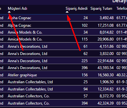
2-Multi-column sort for tables
Feels like it was just yesterday that you were crying “But why? We need this feature!” and I was saying “I know, I know, it is so ridiculous but it is what it is!” And now we finally got this update! To add more columns to the sort order, Shift + click the column header you would like to add next in the sort order.
When you click a column title with the SHIFT key, it accepts that column as sorting measure as well.
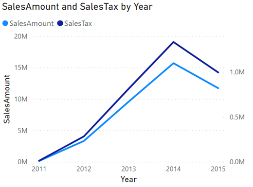
3- Dual axis for line chart
It was our subjects in recent trainings! Now we can add a second axis that allows us to draw two trends with different ranges along the same X-axis progression. We can compare two different units in the same graphic at the same time. Like Sales Amount&Sales Total, Sales Tex&Sales Total…
4-Filter Pane Search
It was a feature that was available in web but not in desktop. Now it is available for desktop too. You can search the filter you want in the search area. This features is activates as default. You can turn this feature on or off in the reports settings of the Options dialog.
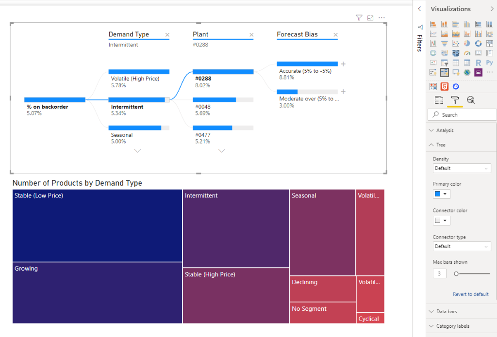
5-Updates to decomposition tree
Some people were very happy when the decomposition tree came us default to Power BI! The decomposition tree now supports modifying the maximum bars shown per level. The default is 10 and users can select values between 3-30. Setting a low number is particularly handy if you don’t want the decomposition tree to take up too much space on the canvas. That way it’s more useful.
6-New DAX function: COALESCE
A new DAX Function enters our lives with the Power BI March updates. The COALESCE function returns the first expression that does not evaluate to BLANK. So, what the hell does this mean? There are already a lot of functions as “That does not evaluate to BLANK”… They syntax of this function is:
COALESCE(, [, ]…)
It goes like that step by step and shows us the non-blank one. As outcome, it returns us a scalar expression. We can use it in an example like that:
When we do a calculated and show in on card, we don’t want the blank expressions to be visible. We want something like 0,1,100,”-“. For this we use the IF(ISBLANK(…) expression. Right at this point we can use this function.
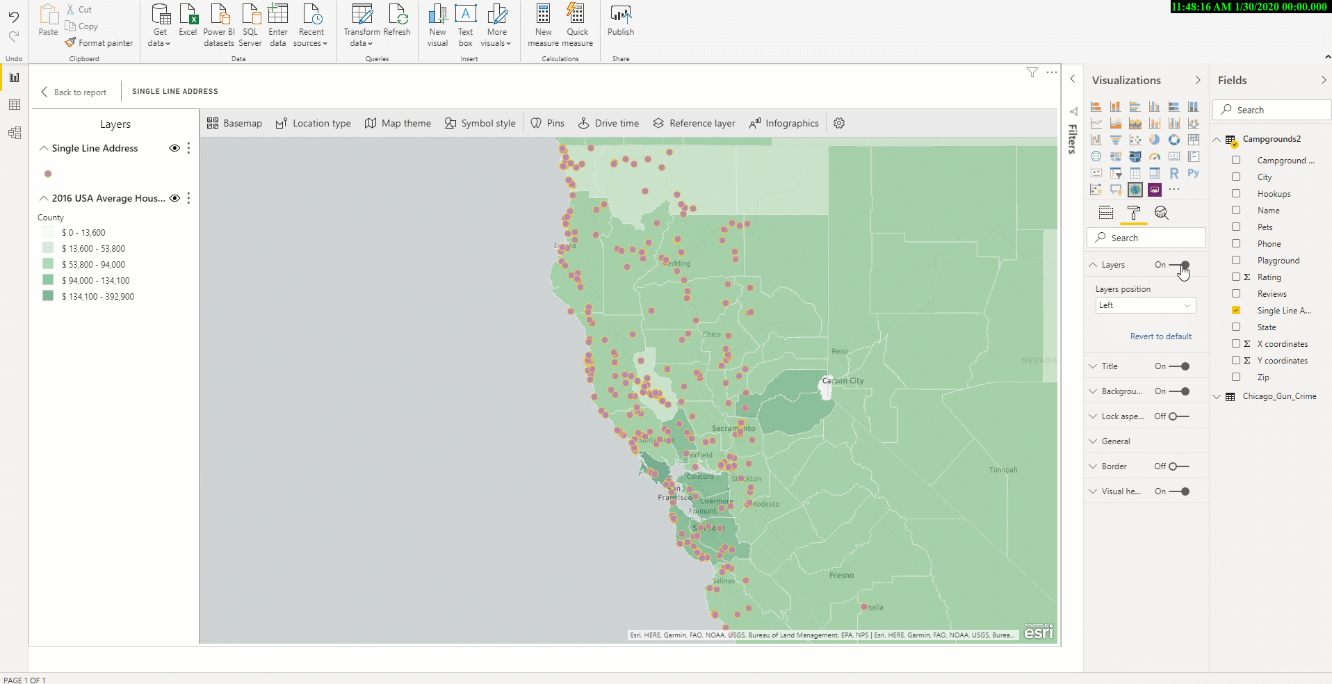
Product of Esri -the most known map and cartography company of the world: ArcGIS. We have been using its maps as default anyways for a long time and knew that more detailed features would come. Most features are available for Premium and some can be used in Pro. First of all, let me show you the location of ArcGIS maps.
ArcGIS location
When you click here, there are 3 types of connections:
ArcGIS Enterprise
ArcGIS Online
Standart
The ArcGIS Enterprise and ArcGIS Online options are for users who have the premium app subscription and provides all the capabilities of Standard and extra capabilities, including additional geocoding, technical support, and access to mapping reference layers, and more. The Standard option is free and provides basic mapping capabilities. I leave the features below for you to check them.
Multiple Reference Layer
All premium app users can now add multiple reference layers to a single map visualization within Power BI. A reference layer is information represented on a map. It adds context to your operational business data. For example, let’s say you have mapped your store locations in Power BI. You can now overlay it against reference layers such as income, age, competitor locations or other demographics to gain valuable insights. You can add data and layers that are published and shared online by the ArcGIS community as well as layers from your ArcGIS Online or ArcGIS Enterprise organization.
New table of contents
A new table of contents that will help all ArcGIS Maps for Power BI users (free and premium) better visualize their data on a map has been added. Now, when you drag data to a location field well and see it on a map, you can also see a table of contents that lists all the layers on the map and shows the features represented by the layers. This allows your report viewers to quickly understand the data that they are seeing.
8-Data Sources
Is an update without a new data source an update at all?
HIVE LLAP: This connector provides both Import and Direct Query capabilities and the ability to specify Thrift Transport Protocol as ‘Standard’ or ‘HTTP’.
Cognite: The Cognite Power BI connector enables data consumers to read, analyze, and present data from Cognite Data Fusion (CDF).
We have shared our favorite updates for this month. You can click here for our other articles about Power BI. Click here to download the latest version of Power BI Desktop.
Hello dear reader! In this article we will be analyzing a Power BI DAX Function, the FILTER function. It is one of the most frequently used ones. In our previous articles we talked about most frequently used basic functions like this one. You can read the details here.
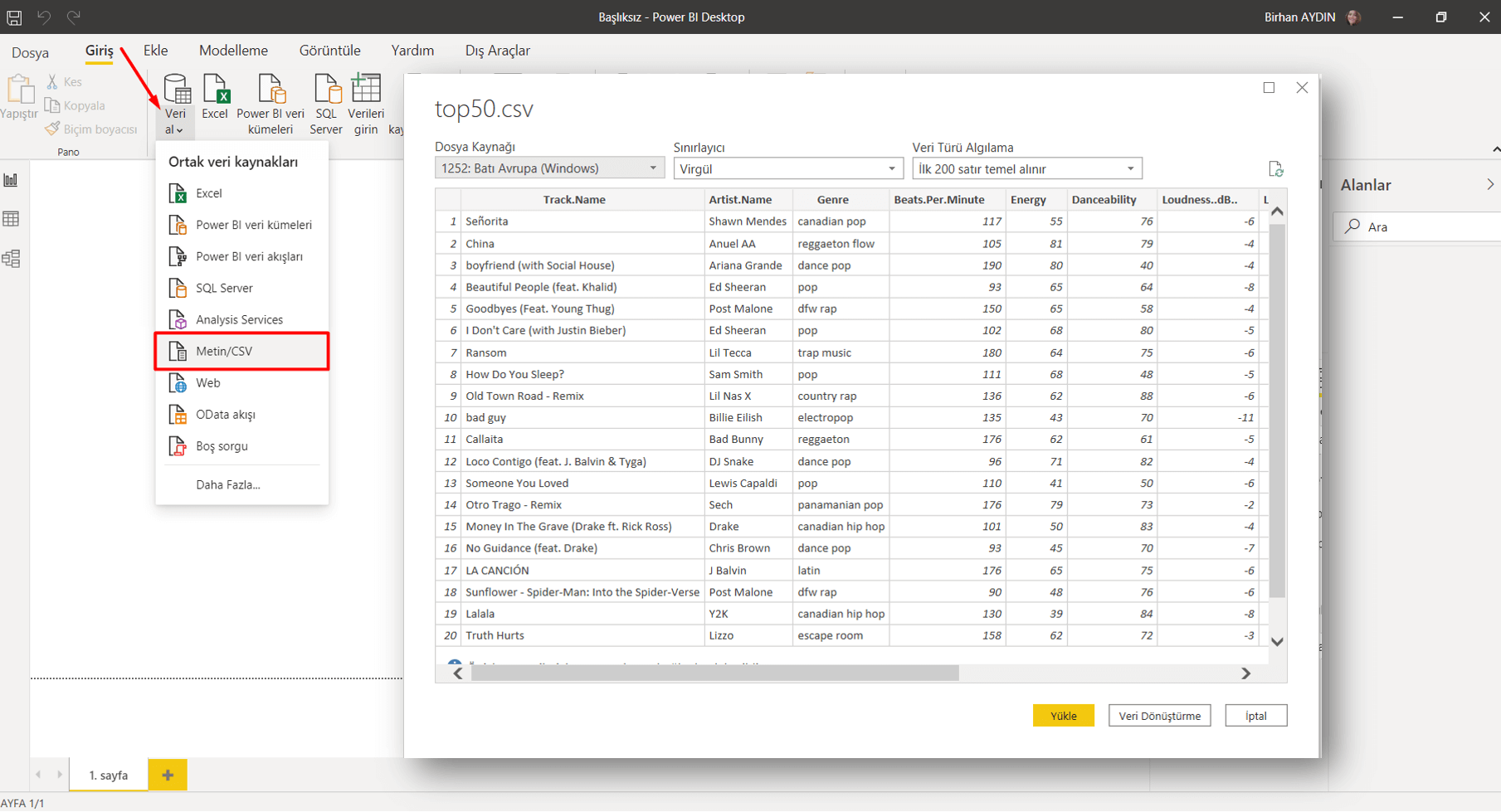
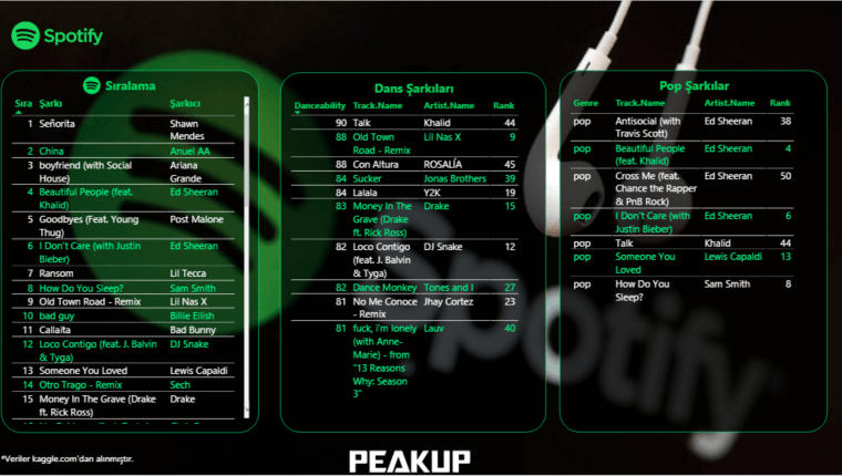
Let’s talk about the data set we will be using first. The data set that we will import from kaggle.com again contains top 50 songs on Spotify and their details. You can download it here.
The FILTER function allows us to create datasets filtered by the criteria we desire. It gives a table as a result of the function. Therefore it is among the table functions. If we are going to use the FILTER function only, if we are not going to use it in any other function, we have to use it with the New Table command. The syntax of the FILTER function goes like that:
=FILTER( , )
Both of these parameters have to be written, or the function will fail. If we are to explain the filtering a bit more, we can put it like this: True or false statements should be obtained as a result by using mathematical signs like <“, “>”, “=”, “<>”. You can use logical operators (And & Or) for more a complex filtering.
Let’s start with transferring this data set to Power BI. For this we will go Home > Get Data > Text/CSV. To get the .csv file you click OK and it will recognize the separator between texts and show the version divided into columns in the Navigation window. We go Load here and make it load to Power BI.
We will create 2 new tables with the FILTER function in this data set. For this we click on the New Table command under the Modelling tab.
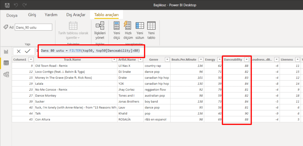
1-Filtering by Numbers
Out first table is going to be of those songs we just want to dance to! The column that will enable us to run this query is the Dancebility column. We will list the values over 80 on this column. To write this filtering statement we will be using the “>” mathematical operator. Since we will be filtering rows on a column, it is going to be enough for us to write the name of that column. The syntax we will write goes like this:
Dance over 80 = FILTER(top50, top50[Danceability]>80)
2-Filtering by Text
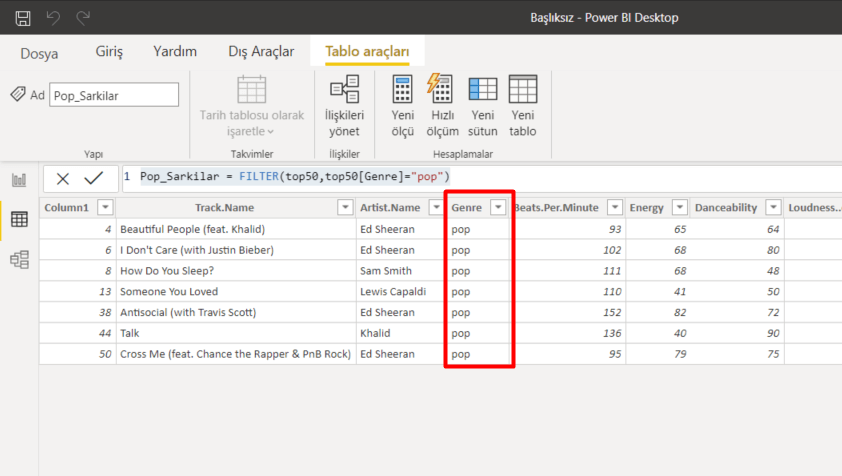
Our second table is going to be listing the Pop songs. For this we will be using the Genre column.
Pop_Songs = FILTER(top50,top50[Genre]="pop")
So we filtered by both text and number. If you paid attention, we didn’t put the numbers in double-quote. Double-quote is used for texts only. And never forget that:
Two single quotes don’t make a double-quote!
I mean apostrophe by single quote. Sometimes some people try to do the action by using two apostrophes. Since this statements has a different meaning in computer language, even though it looks write you will face an error as the result of the function. So I recommend you to always be careful about this.
We came to the part where we move the new tables we obtained from these actions to the report. I moved the columns we filtered first, and then put the non-filtered array to the left. You can get the file here if you want.
We analyzed the the Filter Function which is a Power BI DAX Function. We will keep analyzing other functions, various issues, dead-ends, and possibilities in other articles. Take care!
Hello dear reader! We will be talking about Power BI April updates in this post. They expressed these month’s updates by saying “There are a ton of new features”. But now everything will come to the light! I compiled everything below to give you an idea about this.
Personalize Visuals (Preview)
It has been forever since they talked about this feature, they told that it was coming. Turns out that the month in which this feature is presented to the users is this month. We are facing a different feature. Normally the process while creating a report goes like that: Report designer creates the report, certain people that will use it share their ideas, charts, their places etc. get readjusted accordingly and report is opened to the users. Of course after all this process there are people saying “This chart would be better that way,” “I don’t understand anything from this chart, can we change it to a bar chart?” And right at this point this feature steps in running with the hare and hunting with the hounds and says “Well you change it the way you want dear” to those who are not happy with the chart.
Of course for this, this feature has to be activated in report settings in app.powerbi.com. You can also activate it on the power bi desktop application. And as a chart all the ones that the report contained while preparing come as an option. The more interest you don’t just change the chart, you also get to change the fields added to the chart. Thus at the end of the day, users of this report might see something completely different than the report you created in the first place. I think that it will become a need for the report designers to know who used this feature and made changes in the future.
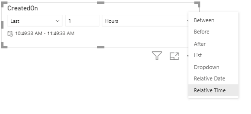
Relative Time Filter
We usually use year and month for filtering in Power BI, and prefer charts for day-based view. Sometimes we want to use filter slogans that we are use in the spoken language: “Last month”, “Last 3 months”, “Next 1 week” etc. These filters are called relative filters. With the update this month, Relative Time filter comes in addition to all these filters. With this we can add hour, minute filters.
Rectangular lasso select across visuals
We have been waiting for such a long time! Where have you been, where?! :'( We shed a lot of tears while creating reports, but finally it is here. Being able to drag everything with mouse on PowerPoint and not being able to choose here… it did offend me I’ll be honest. Pardon my excitement. Now we can choose by pressing control on Power BI Desktop as well. In my opinion this is the best Power BI April update. 😁
Improved discoverability for conditional formatting
You remember how we were looking for visual titles and colors as if we were looking for happiness? They decided to make them visible and put them right next to the related area. That’s it for this feature. 😊
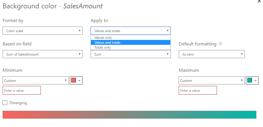
Conditional formatting for totals and subtotals in table and matrix
Let’s be honest, we do apply conditional formatting and we are pretty fond of it. On the other hand, every single time we would ask questions like: “Why can we not apply it in totals?” We welcome this highly-voted feature this month. If we want, we can apply it to values and totals together or just to totals. Excellent!
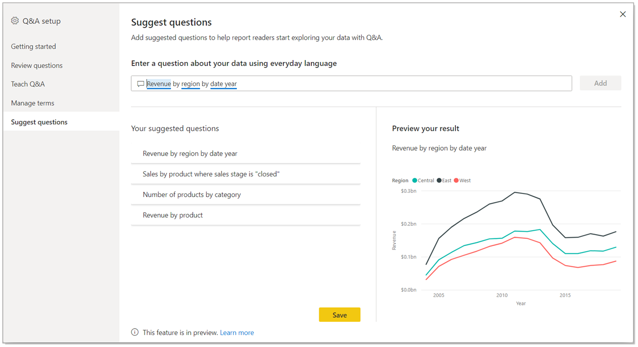
Suggest Questions to Q&A
I wrote about the Q&A title in details in this article about updates. In addition to this, they are adding a new feature to the Q&A visual. Now we can suggest questions. We define some recommend titles for the report users when we put a Q&A field to the report.
Measure conditions in Q&A
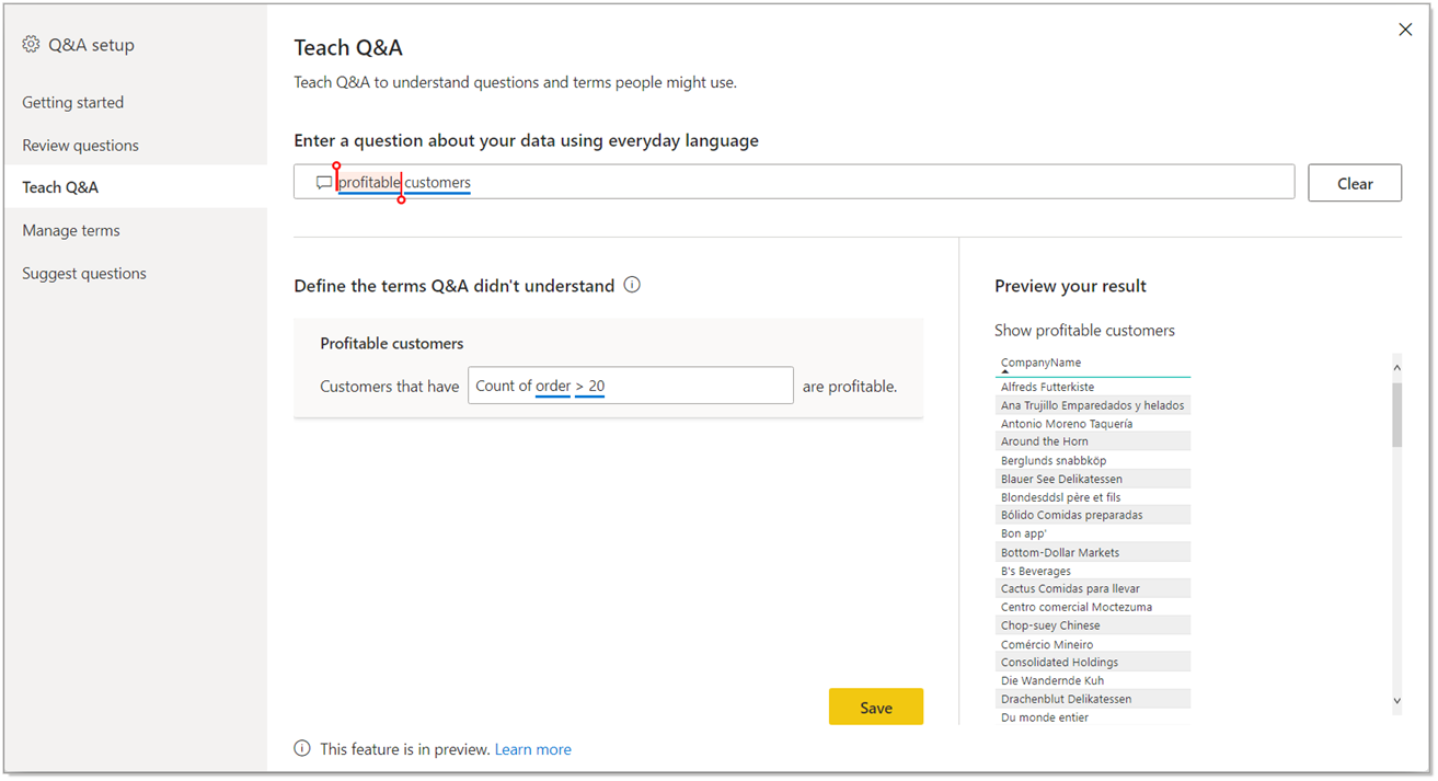
In the first version of Teach Q&A, we could only use columns. Now there is measure support as well. Now we can use expressions like “Bigger than a certain value” or “Smaller than a certain value” by using measure conditions. Thus, it is more useful.
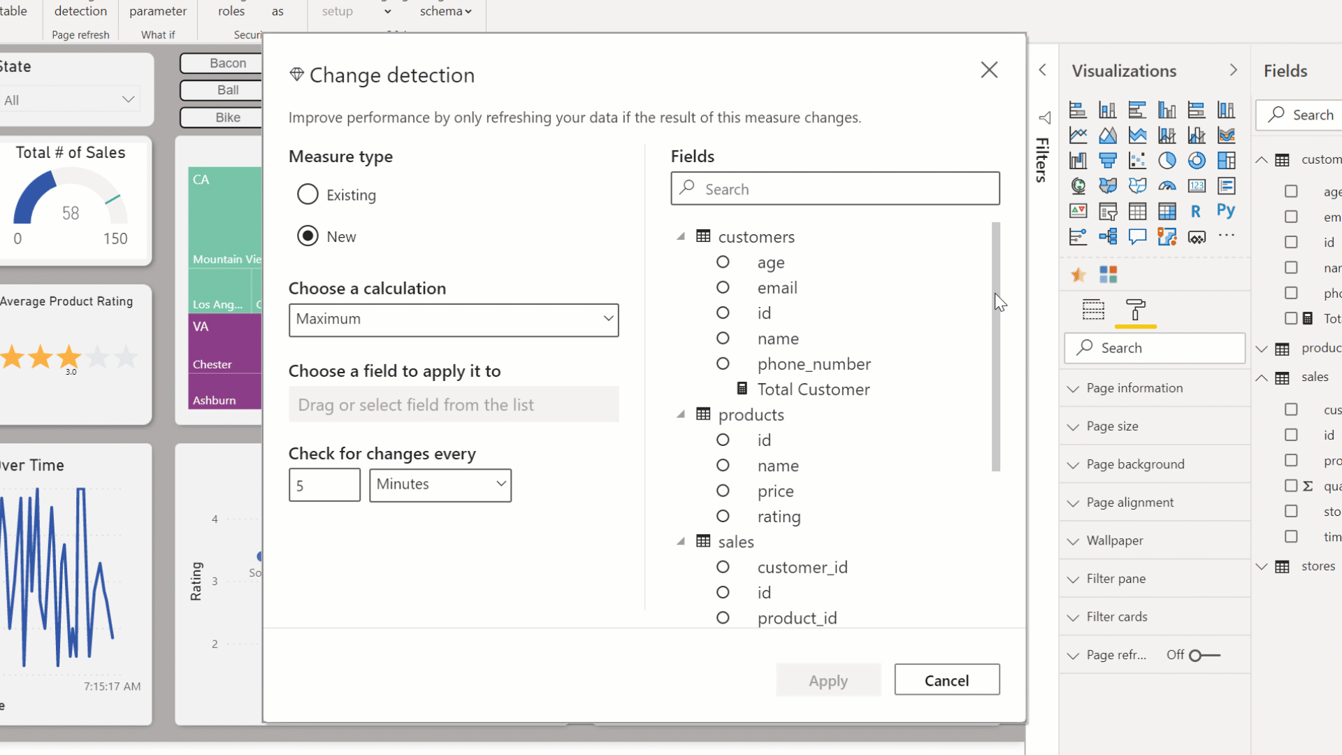
Change Detection for Page Refresh
This month, a new feature for the automatic page refresh is presented. If you are wondering what the automatic page refresh, you can take a look at this article about updates. It is a practical feature for frequent refresh scenarios. When you set the page refresh as 1 second, even though the data didn’t change, page refreshed continuously and when you think about it, since data change that frequently, it is an inefficient action. For this very reason, they have created a new approach. With the approach, you create a special measure named “Change detection”.
In this measure you choose the calculation method and the field you will watch the change of and frequency. The diamond we see on the left of “Change Detection” tells us that it is Premium only. 😢 You need to add this feature to this field when you turn on the “Page Refresh” feature. Apart from that, this feature can be used only in Direct Query. You can create a measure for each .pbix file. Premium capacity admin must turn this on in the admin portal.
New Visualizations
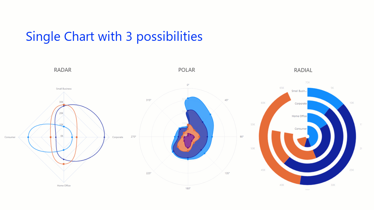
Radar Chart
I love using Radar Charts. I think they are very practical when it comes to showing strong and weak areas. There are new visualizations concerning this.
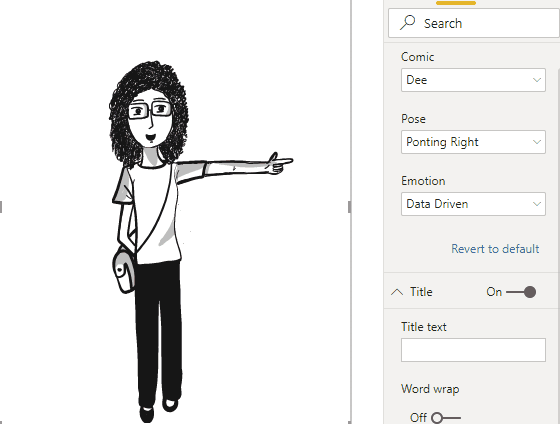
Comicgen
An interesting visualization that can be visualized as emotion and pose in accordance with each KPI has been created.
So much for Power BI April updates. You can click here to download April updates. I am excited to see what awaits us. Take care.


 2-Define the necessary subscriptions to the page.
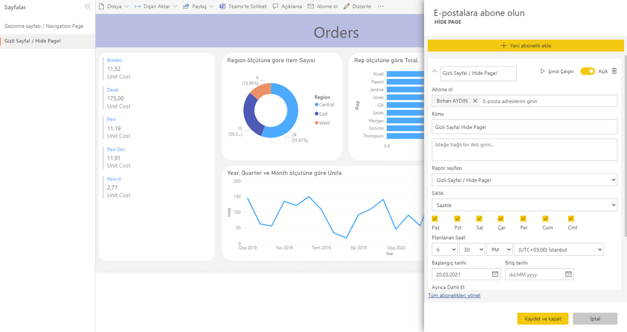 3- Click on “Edit Report” and hide the page.
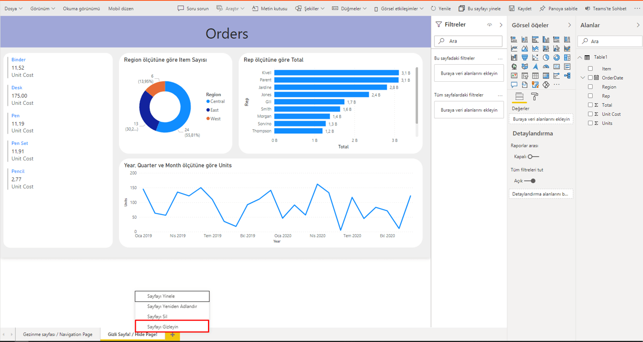


 The hard thing is here for the user to make the correct decision. For this, we will use on of the tools developed for Power BI: Tabular Editor. As well as you can use these tools directly, you can already add them under a tab on Power BI Desktop. You can check the 3rd title