Power BI – 2020 April Favorites

Hello dear reader! We will be talking about Power BI April updates in this post. They expressed these month’s updates by saying “There are a ton of new features”. But now everything will come to the light! I compiled everything below to give you an idea about this.

Personalize Visuals (Preview)

It has been forever since they talked about this feature, they told that it was coming. Turns out that the month in which this feature is presented to the users is this month. We are facing a different feature. Normally the process while creating a report goes like that: Report designer creates the report, certain people that will use it share their ideas, charts, their places etc. get readjusted accordingly and report is opened to the users. Of course after all this process there are people saying “This chart would be better that way,” “I don’t understand anything from this chart, can we change it to a bar chart?” And right at this point this feature steps in running with the hare and hunting with the hounds and says “Well you change it the way you want dear” to those who are not happy with the chart.

Of course for this, this feature has to be activated in report settings in app.powerbi.com. You can also activate it on the power bi desktop application. And as a chart all the ones that the report contained while preparing come as an option. The more interest you don’t just change the chart, you also get to change the fields added to the chart. Thus at the end of the day, users of this report might see something completely different than the report you created in the first place. I think that it will become a need for the report designers to know who used this feature and made changes in the future.

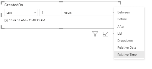
Relative Time Filter

We usually use year and month for filtering in Power BI, and prefer charts for day-based view. Sometimes we want to use filter slogans that we are use in the spoken language: “Last month”, “Last 3 months”, “Next 1 week” etc. These filters are called relative filters. With the update this month, Relative Time filter comes in addition to all these filters. With this we can add hour, minute filters.

relative time filter

Rectangular lasso select across visuals

We have been waiting for such a long time! Where have you been, where?! :'( We shed a lot of tears while creating reports, but finally it is here. Being able to drag everything with mouse on PowerPoint and not being able to choose here… it did offend me I’ll be honest. Pardon my excitement. Now we can choose by pressing control on Power BI Desktop as well. In my opinion this is the best Power BI April update. 😁

rectangular lasso select

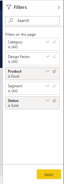
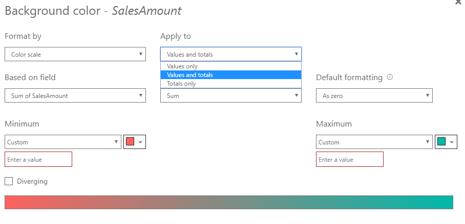
Improved discoverability for conditional formatting

You remember how we were looking for visual titles and colors as if we were looking for happiness? They decided to make them visible and put them right next to the related area. That’s it for this feature. 😊

conditional formatting

Conditional formatting for totals and subtotals in table and matrix

Let’s be honest, we do apply conditional formatting and we are pretty fond of it. On the other hand, every single time we would ask questions like: “Why can we not apply it in totals?” We welcome this highly-voted feature this month. If we want, we can apply it to values and totals together or just to totals. Excellent!

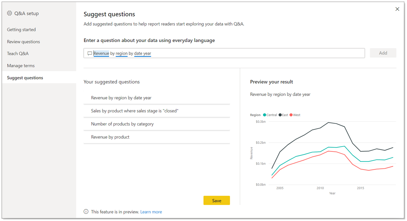
Suggest Questions to Q&A

I wrote about the Q&A title in details in this article about updates. In addition to this, they are adding a new feature to the Q&A visual. Now we can suggest questions. We define some recommend titles for the report users when we put a Q&A field to the report.

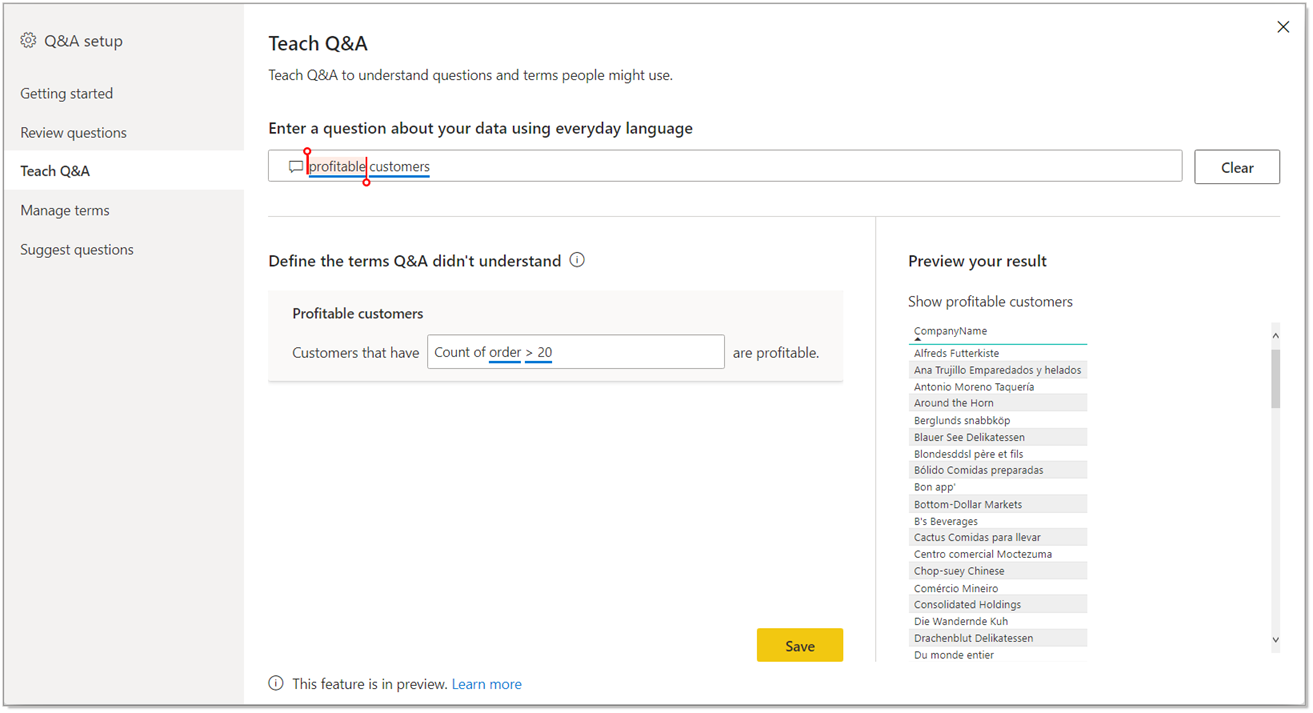
Measure conditions in Q&A

In the first version of Teach Q&A, we could only use columns. Now there is measure support as well. Now we can use expressions like “Bigger than a certain value” or “Smaller than a certain value” by using measure conditions. Thus, it is more useful.

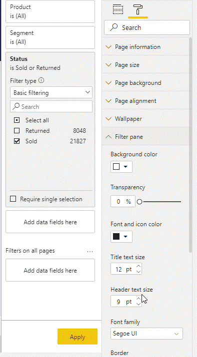
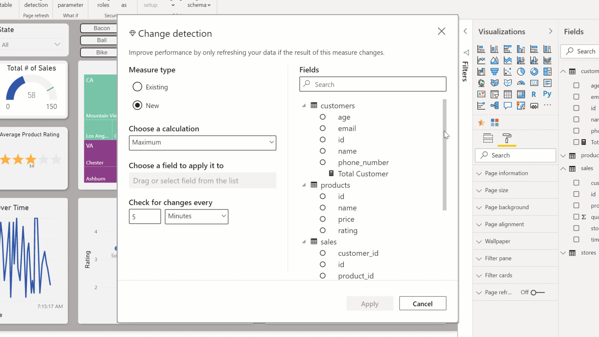
Change Detection for Page Refresh

This month, a new feature for the automatic page refresh is presented. If you are wondering what the automatic page refresh, you can take a look at this article about updates. It is a practical feature for frequent refresh scenarios. When you set the page refresh as 1 second, even though the data didn’t change, page refreshed continuously and when you think about it, since data change that frequently, it is an inefficient action. For this very reason, they have created a new approach. With the approach, you create a special measure named “Change detection”.

In this measure you choose the calculation method and the field you will watch the change of and frequency. The diamond we see on the left of “Change Detection” tells us that it is Premium only. 😢 You need to add this feature to this field when you turn on the “Page Refresh” feature. Apart from that, this feature can be used only in Direct Query. You can create a measure for each .pbix file. Premium capacity admin must turn this on in the admin portal.
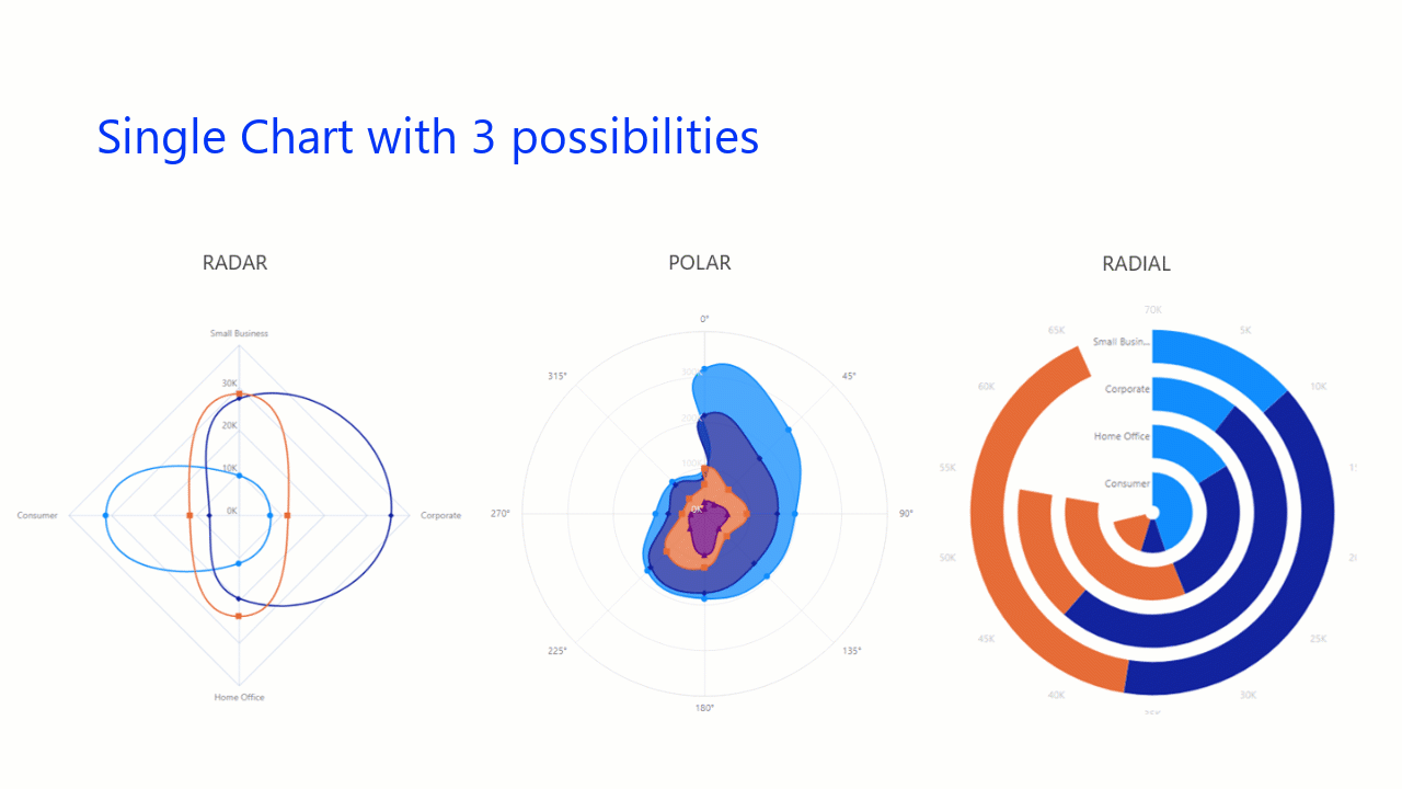
New Visualizations

Radar Chart

I love using Radar Charts. I think they are very practical when it comes to showing strong and weak areas. There are new visualizations concerning this.
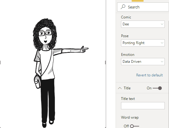
Comicgen

An interesting visualization that can be visualized as emotion and pose in accordance with each KPI has been created.


So much for Power BI April updates. You can click here to download April updates. I am excited to see what awaits us. Take care.

Good game well played.

Power BI – 2020 May Favorites

Hello dear reader! Here we are with the Power BI May updates. Compared to last month, this month’s updates are a bit more superficial. But of course there are some subjects that stand out as always. Let’s go and start analyzing the Power BI May updates right away.

1-Apply All Filters

There is a new button in the filter field. What does this mean? It means that now we have some options while applying filters:

  • The report can change immediately in accordance with the values we choose on the filter field.
  • You can add Apply button to filter headers from the filter field. In this step, you need to press this button after making filter choices.
  • You can ad an Apply button that would apply all the filters at once on the filter field. First you do your filters on all the headers and than press this button.

You can access this new option by going to File > Options and settings > Options > Query reduction.


The necessity of it is arguable but to tell the truth, I know that it has been asked if all these new filter pane skills didn’t exist. So it is for sure that their existence will make some happy. By the way with this update we say goodbye to the old filter pane, bye sweetie.

2- Buttons Now Support Fill Images

A feature very convenient for people who want to use different images and shapes instead of writing an expression only. You can put different images to default, on hover, on press, and disabled options. You can access the option where you can use a button for this on the Fill field.


buton image

3-Drop Shadow Support for Visuals

I think this is the most prominent one of Power BI May updates. I am really happy to to have shadow effect! It gives dimension to the chart field and thus is very useful. Before, we arranged these shadowed fields on PowerPoint and than brought it to the Power BI background. By the way, there a lot of options like angle, transparency under the Shadow title. Since we don’t have to do this anymore, a wide range of people will be satisfied. ❤

shadow, gölge

4- Conditional Page Navigation

Drill through option that was on preview is now generally available. Not only that, they also added conditional page navigation! This is a huge step. This means that you can show pages based on users! Let’s analyze its details all together. The main logic is that you need to enter the name of the page that will navigated by conditions into the DAX indicator.

5-Feature Table (Preview)

Actually it is one of the most interesting features of this month. Before, you had to download the Excel Analyzer extension to your computer that would run the Power BI data sets you were going to work on. After this step you had to download the data set connection. Now we can find the Power BI Dataset header on Excel. But for now, you have to have all the Office Insider programs to have this feature. I am waiting for the moment when we will be talking about it in detail when it is available for all users!

filtre butonu

6- New Data Source

  • Witivio

Witivio is an enterprise chatbot platform for employees with a deep integration in Microsoft 365 and the Power Platform. Without code, users can design and monitor chatbots for HR, IT HelpDesk and change management. Chatbot admins can track the usage and the performance of their chatbots to build advanced analytics.

You can find this connector in the Online services section of the Get data dialog.

  • Linkar Connector 

Linkar is a suite of components that facilitates efficient connectivity to MultiValue Databases. Linkar SERVER works with almost all MultiValue Database platforms centralizing connections and optimizing DBMS license usage. Client apps use Linkar CLIENT libraries to interact with the database through Linkar SERVER, with bindings for popular languages. This connector allows easy integration with MultiValue Databases through the Linkar platform.

You can find this connector in the Database section of the Get data dialog.

 Webtrends Connector

Webtrends Analytics is a Microsoft-preferred solution built from the ground up for the nuances of measuring performance of your website or SharePoint environments. This connector allows you to import your data into Power BI via our Data Extraction API (REST) with point and click ease. All reports on an individual profile are now available at once; no more limited report lists. The date range options have been expanded to allow standard report periods as well as custom date ranges. A customer account with Webtrends is required to use the connector.

You can find this connector in the Online services section of the Get data dialog.

Planview ProjectPlace connector

Get work done across projects and teams. Projectplace lets you plan, collaborate and track progress of all projects and assignments in an easy and user-friendly way.
This connector is supported by Planview as the preferred method of reporting on ProjectPlace moving forward. Existing users of the ProjectPlace connector should consider rebuilding their reports on this new, Planview maintained, certified connector.

You can find this connector in the Other section of the Get data dialog.

Shortcuts Business Insights connector

The Shortcuts Business Insights connector enables you to consume, read and analyze your data collected via your Shortcuts point of sale product of choice. Gaining access to this data will enable you to realize valuable business insights from your appointment, transactional, client, employee, product, and service data. These insights will allow you to better serve your customers and anticipate their needs, while growing your business to its full potential.

You can find this connector in the Other section of the Get data dialog.

Vessel Insight connector

Vessel Insight is a vessel to shore data infrastructure delivered as a service. The service enables shipowners, operators, and charterers to capture data from onboard systems such as propulsion, navigation, cargo, VDR as well alarm and engine management systems. Vessel Insight aggregates and contextualizes the data before transferring it to the cloud using the KONGSBERG Global Secure Network. The Vessel Insight Power BI connector makes it easy to integrate and combine vessel data with existing systems and streamline reporting and decision making.

You can find this connector in the Other section of the Get data dialog.

Zoho Creator connector

Zoho Creator is a low-code cloud software which lets you create custom applications for your business. Zoho Creator can collect data, automate business processes or workflows, analyze the data in reports, and collaborate with your application users. The Zoho Creator connector allows you to analyze data and share insights based off all data in Zoho Creator, aside from the pivot report.

You can find this connector in the Online services section of the Get data dialog.


Power BI may notable updates go like that! You can click here to download this month’s update. You can reach our other articles about Power BI here. Take care.

Good game well played.

Power BI – Our 2020 June Favorites

Hello there dear reader!  As much as the weather has different opinions on this subject, according to the seasons calendar they taught us in the 1st grade,  summer is here! This month even if we write about just one of the updates, it would be enough. What an update! Come on, lets start analyzing Power BI June updates right away.

Without keeping you waiting for too long, here is the superstar of the Power BI June updates:

1- Enhancements to mobile authoring

We always liked the fact that Power BI had mobile authoring. Of course it lacked some stuff. For example the squares were too big. Not being able to change the background, not being able to place, not being able to put objects on top of each other could be a bit of a pain in the neck. We got rid of all of them with just one update! Now, isn’t that amazing?

We don’t have to display expressions with low values in huge areas anymore, we can place them to an empty part of a graph. Thus we obtain a mobile layout fully matched with the design of the report. We can easily find images by their names.

There is one more thing that I am still waiting for:  Images that are not displayed on page view can be displayed on mobile layout. For example I use a slicer on page view but it is not useful on mobile layout. I need another slicer special for mobile layout. I hide these slicers or any image that I will be using behind the other graphs. I wish it was not necessary, but i do believe that it will not be in the near future. 😁

2-Automatic Page Refresh

It was a feature that made Pro users on Premium cry out “Aren’t we gonna have automatic page refresh too?” Finally it is released for Pro as well. Now Pro users too can enjoy instant refresh. To enable this feature you have to connect to a Direct Query source with this method. After that you can see this feature in page properties.

3-Enhancements to Hierarchical Slicer

In February hierarchical slicer was introduced to us. We had some issues since then, like issues with icons and font size. It is indicated that with this month’s update we got a new slicer cleared off these issues completely. Now we have more options for expand/collapse icons. Now we are able to customize indentation for child items -we had too seek it in the space back in the day as you know. Also the icons are scaled with the font size.


4-RLS is now supported for Featured Tables in Excel’s Data Types gallery

The matter of connecting to Power BI datasets from Excel is developing rapidly. Now, when you mark a table as featured and then publish to the Power BI service, that table will appear in Excel’s data types gallery even if it has RLS rules applied. Previously, these tables were not shown in Excel. This new enhancement means that users in Excel will only see the rows of data they have access to.

5-Line chart dot formatting options

Sometimes we realized that something was not quiet right, that something was missing in this line chart. But what?  We found the missing point, or shall we say the missing dot. Now we can color the dot corresponding to the related title on the X axis in the line chart. We can do it on the Data colors tab in the formatting pane.

6-Data Connectivity

Palantir Foundry Connector

Palantir Foundry is a platform that reimagines how people use data by removing the barriers between back-end data management and front-end data analysis. Foundry enables users with varying technical ability and deep subject matter expertise to work meaningfully with data. With Foundry, anyone can source, connect, and transform data into any shape they desire, then use it to take action.

This connector will soon be available in the Online services section of the Get data dialog.


You can click here to go to the download page of Power BI June updated version. And to take a look at out other articles on Power BI you can click here.


Wish you all a great month. Take care!

Good game well played.