Hello dear reader! We will be talking about Power BI April updates in this post. They expressed these month’s updates by saying “There are a ton of new features”. But now everything will come to the light! I compiled everything below to give you an idea about this.

Personalize Visuals (Preview)
It has been forever since they talked about this feature, they told that it was coming. Turns out that the month in which this feature is presented to the users is this month. We are facing a different feature. Normally the process while creating a report goes like that: Report designer creates the report, certain people that will use it share their ideas, charts, their places etc. get readjusted accordingly and report is opened to the users. Of course after all this process there are people saying “This chart would be better that way,” “I don’t understand anything from this chart, can we change it to a bar chart?” And right at this point this feature steps in running with the hare and hunting with the hounds and says “Well you change it the way you want dear” to those who are not happy with the chart.

Of course for this, this feature has to be activated in report settings in app.powerbi.com. You can also activate it on the power bi desktop application. And as a chart all the ones that the report contained while preparing come as an option. The more interest you don’t just change the chart, you also get to change the fields added to the chart. Thus at the end of the day, users of this report might see something completely different than the report you created in the first place. I think that it will become a need for the report designers to know who used this feature and made changes in the future.
Relative Time Filter
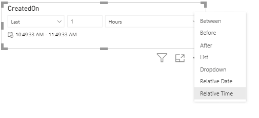
We usually use year and month for filtering in Power BI, and prefer charts for day-based view. Sometimes we want to use filter slogans that we are use in the spoken language: “Last month”, “Last 3 months”, “Next 1 week” etc. These filters are called relative filters. With the update this month, Relative Time filter comes in addition to all these filters. With this we can add hour, minute filters.
Rectangular lasso select across visuals
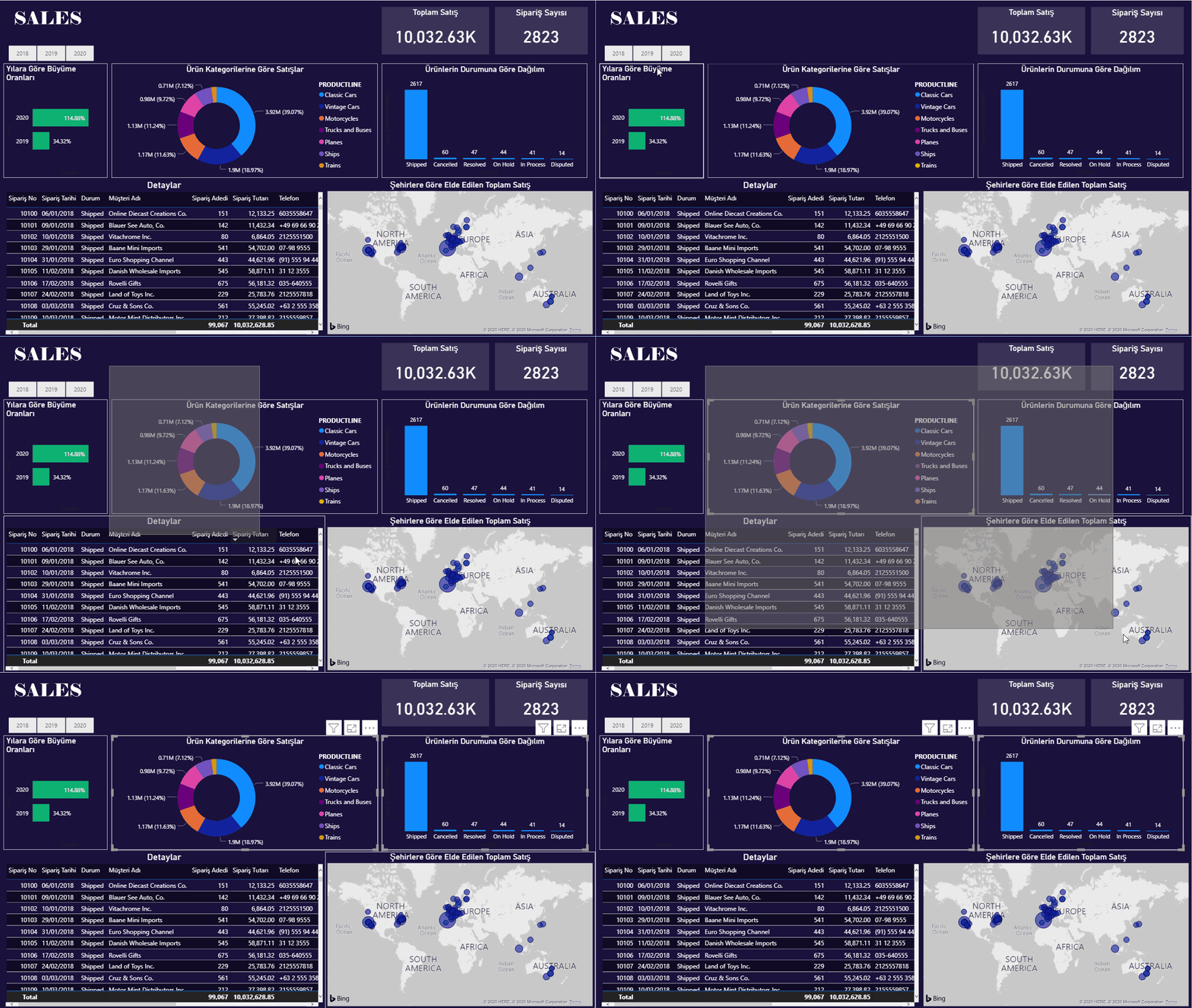
We have been waiting for such a long time! Where have you been, where?! :'( We shed a lot of tears while creating reports, but finally it is here. Being able to drag everything with mouse on PowerPoint and not being able to choose here… it did offend me I’ll be honest. Pardon my excitement. Now we can choose by pressing control on Power BI Desktop as well. In my opinion this is the best Power BI April update. 😁
Improved discoverability for conditional formatting
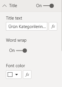
You remember how we were looking for visual titles and colors as if we were looking for happiness? They decided to make them visible and put them right next to the related area. That’s it for this feature. 😊
Conditional formatting for totals and subtotals in table and matrix
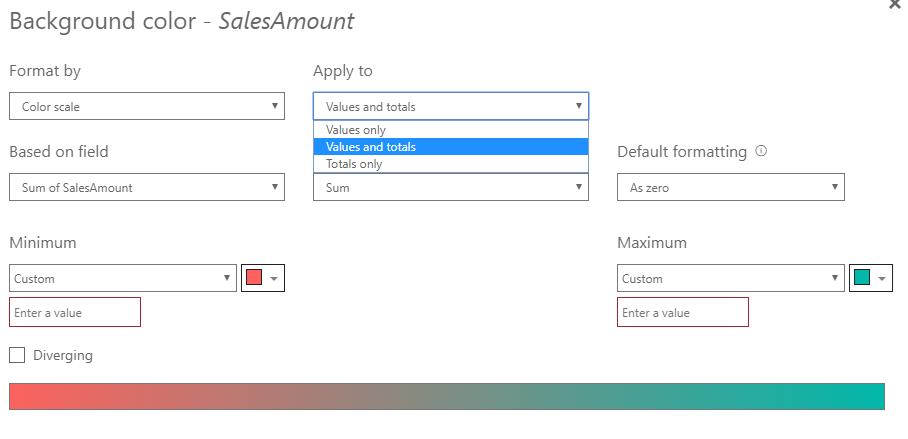
Let’s be honest, we do apply conditional formatting and we are pretty fond of it. On the other hand, every single time we would ask questions like: “Why can we not apply it in totals?” We welcome this highly-voted feature this month. If we want, we can apply it to values and totals together or just to totals. Excellent!
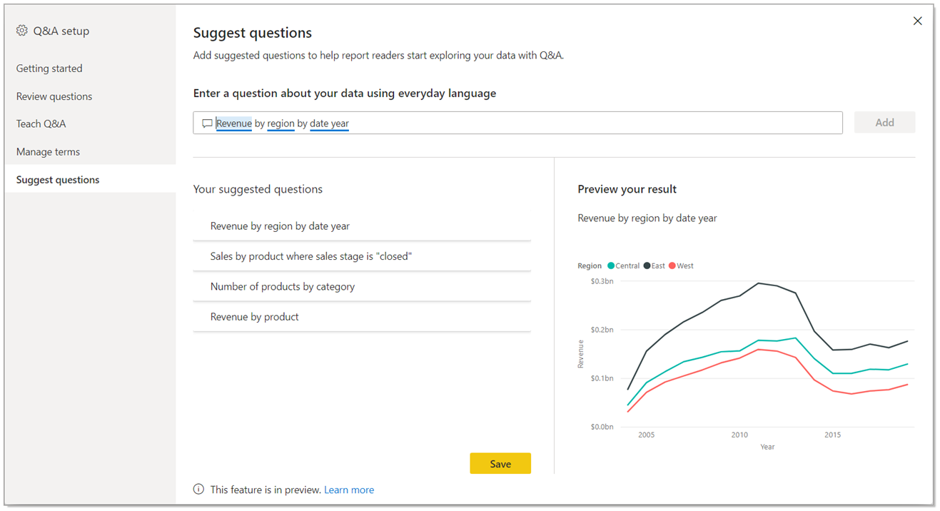
Suggest Questions to Q&A
I wrote about the Q&A title in details in this article about updates. In addition to this, they are adding a new feature to the Q&A visual. Now we can suggest questions. We define some recommend titles for the report users when we put a Q&A field to the report.
Measure conditions in Q&A
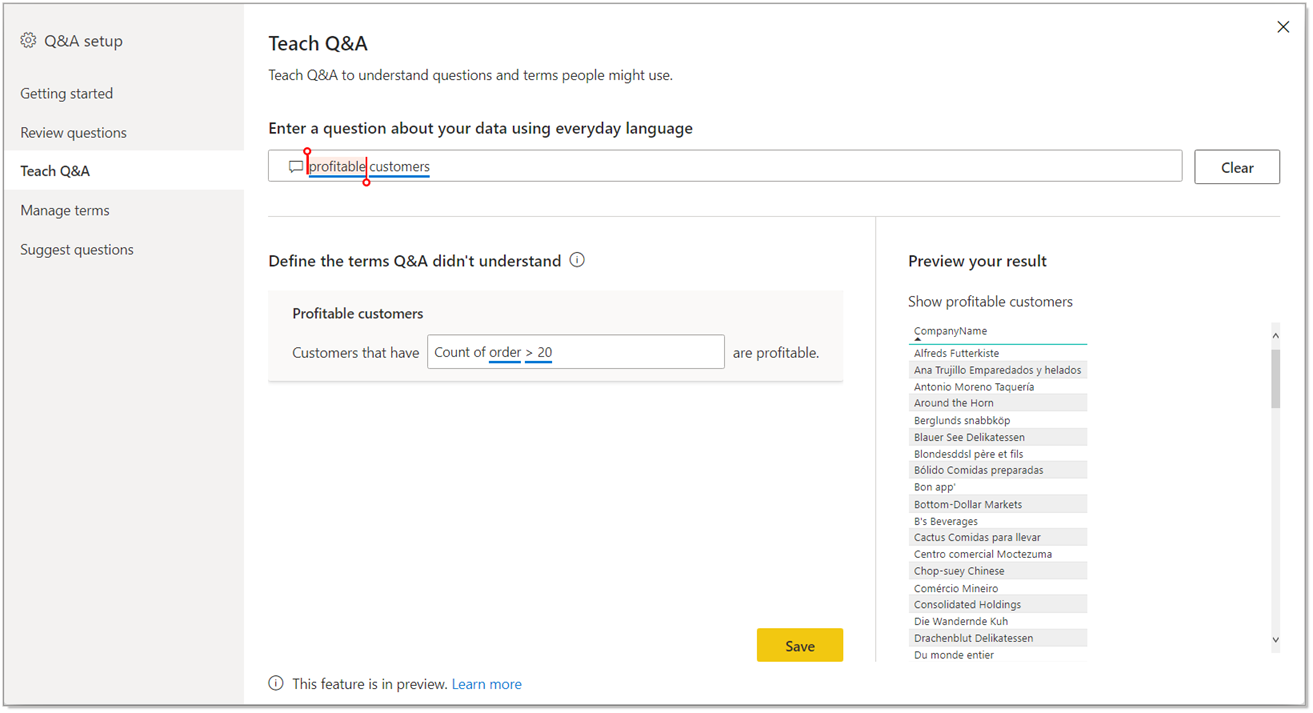
In the first version of Teach Q&A, we could only use columns. Now there is measure support as well. Now we can use expressions like “Bigger than a certain value” or “Smaller than a certain value” by using measure conditions. Thus, it is more useful.
Change Detection for Page Refresh
This month, a new feature for the automatic page refresh is presented. If you are wondering what the automatic page refresh, you can take a look at this article about updates. It is a practical feature for frequent refresh scenarios. When you set the page refresh as 1 second, even though the data didn’t change, page refreshed continuously and when you think about it, since data change that frequently, it is an inefficient action. For this very reason, they have created a new approach. With the approach, you create a special measure named “Change detection”.
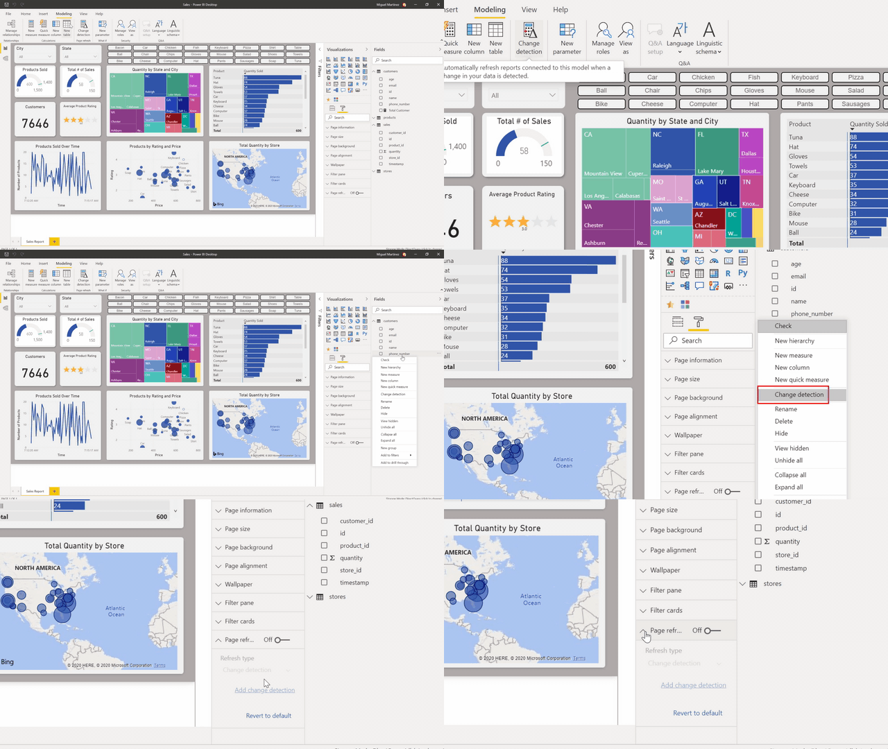
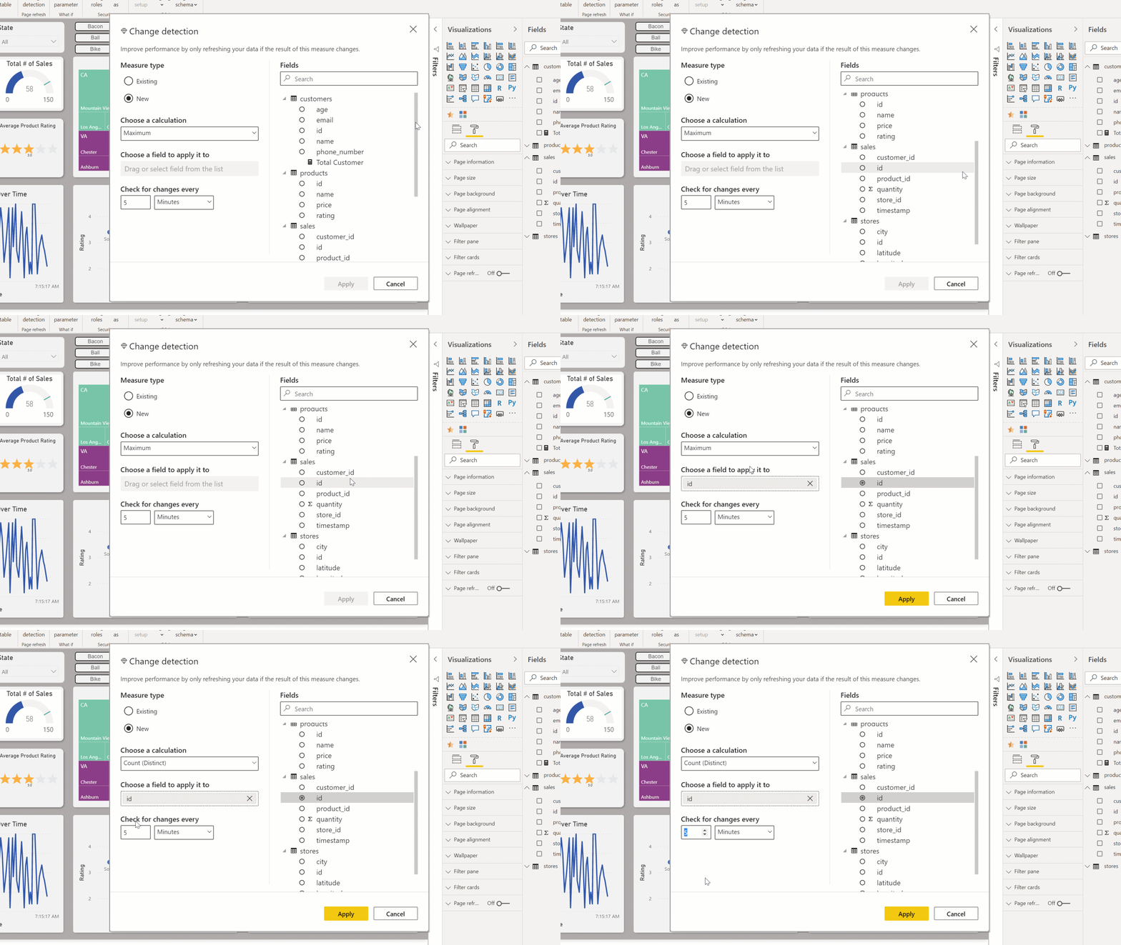
In this measure you choose the calculation method and the field you will watch the change of and frequency. The diamond we see on the left of “Change Detection” tells us that it is Premium only. 😢 You need to add this feature to this field when you turn on the “Page Refresh” feature. Apart from that, this feature can be used only in Direct Query. You can create a measure for each .pbix file. Premium capacity admin must turn this on in the admin portal.
New Visualizations
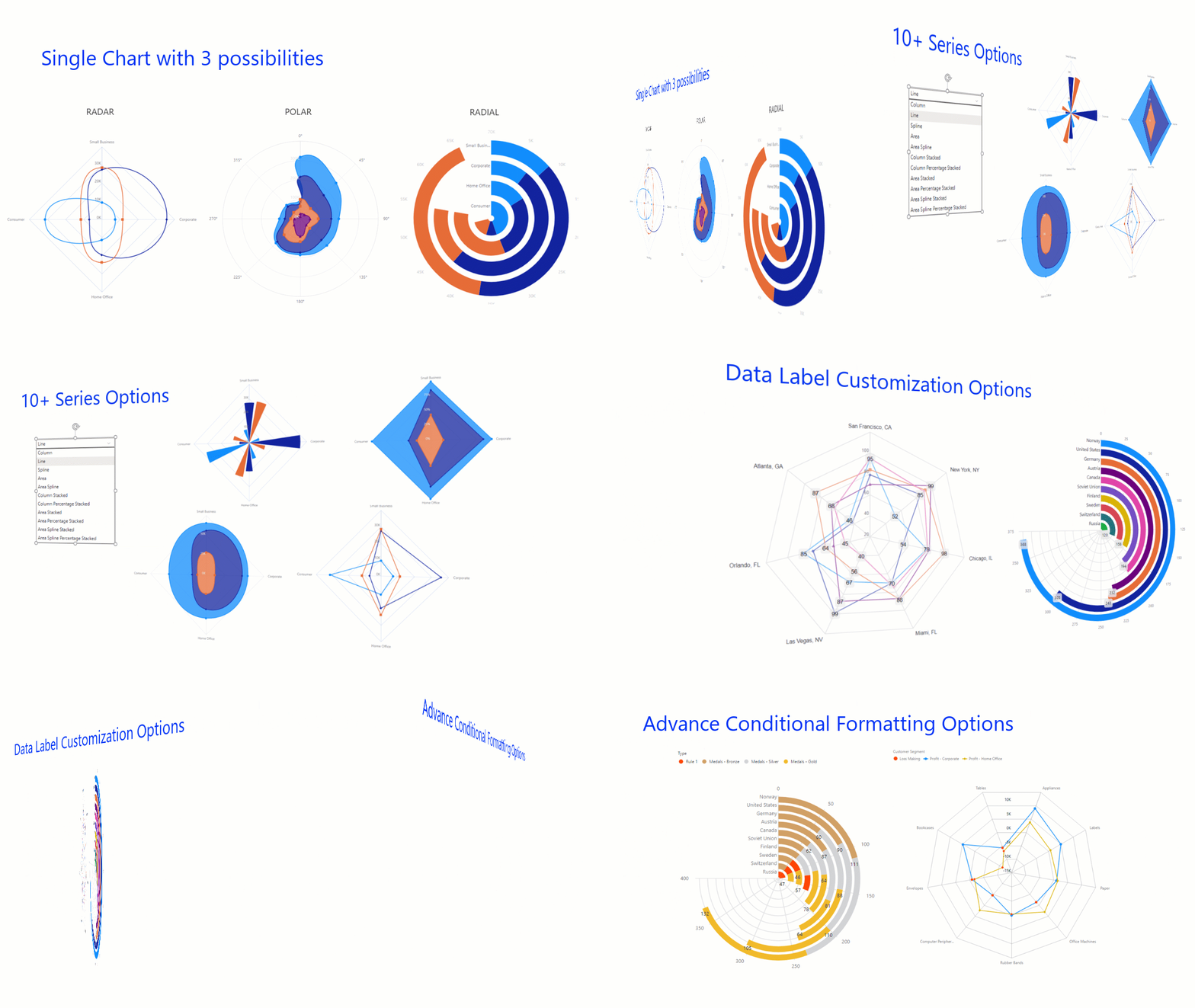
Radar Chart
I love using Radar Charts. I think they are very practical when it comes to showing strong and weak areas. There are new visualizations concerning this.
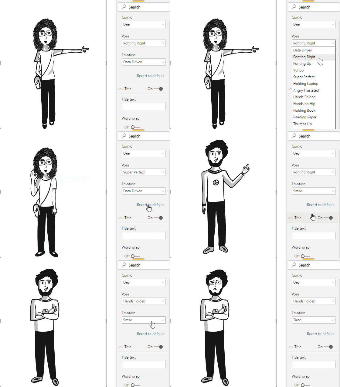
Comicgen
An interesting visualization that can be visualized as emotion and pose in accordance with each KPI has been created.
So much for Power BI April updates. You can click here to download April updates. I am excited to see what awaits us. Take care.

Good game well played.


