Power BI DAX Functions: the FILTER function

Hello dear reader! In this article we will be analyzing a Power BI DAX Function, the FILTER function. It is one of the most frequently used ones. In our previous articles we talked about most frequently used basic functions like this one. You can read the details here.

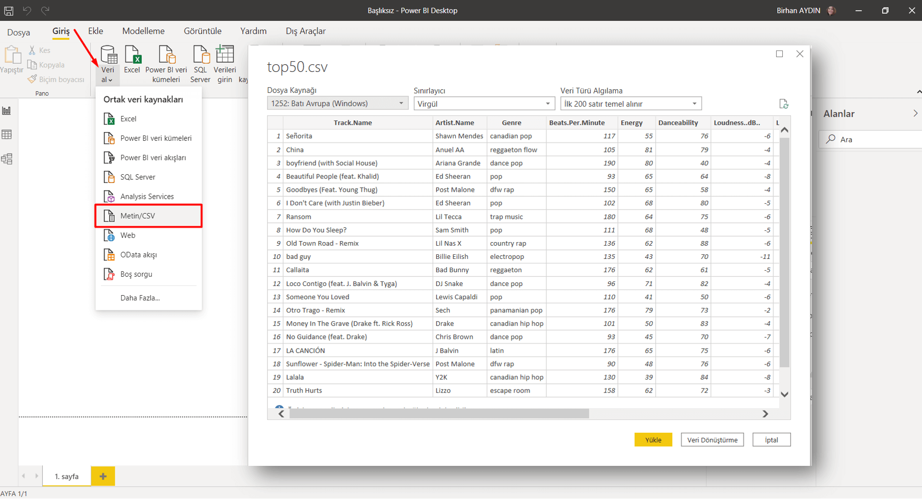
Let’s talk about the data set we will be using first. The data set that we will import from kaggle.com again contains top 50 songs on Spotify and their details. You can download it here.

The FILTER function allows us to create datasets filtered by the criteria we desire. It gives a table as a result of the function. Therefore it is among the table functions. If we are going to use the FILTER function only, if we are not going to use it in any other function, we have to use it with the New Table command. The syntax of the FILTER function goes like that:

=FILTER( , )

Both of these parameters have to be written, or the function will fail. If we are to explain the filtering a bit more, we can put it like this: True or false statements should be obtained as a result by using mathematical signs like <“, “>”, “=”, “<>”. You can use logical operators (And & Or) for more a complex filtering.

Let’s start with transferring this data set to Power BI. For this we will go Home > Get Data > Text/CSV.  To get the .csv file you click OK and it will recognize the separator between texts and show the version divided into columns in the Navigation window. We go Load here and make it load to Power BI.

We will create 2 new tables with the FILTER function in this data set. For this we click on the New Table command under the Modelling tab.

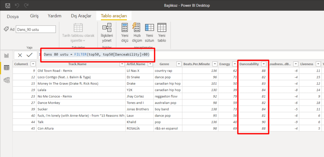
1-Filtering by Numbers

Out first table is going to be of those songs we just want to dance to! The column that will enable us to run this query is the Dancebility column. We will list the values over 80 on this column. To write this filtering statement we will be using the “>” mathematical operator. Since we will be filtering rows on a column, it is going to be enough for us to write the name of that column. The syntax we will write goes like this:

Dance over 80 = FILTER(top50, top50[Danceability]>80)
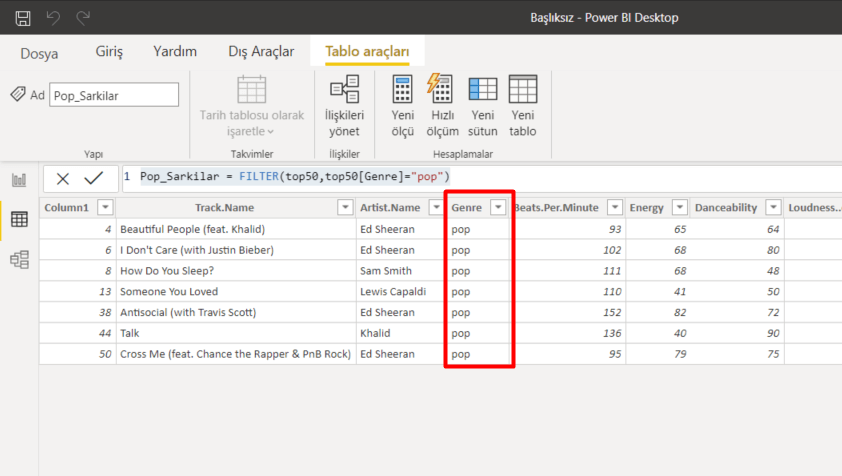
2-Filtering by Text

Our second table is going to be listing the Pop songs. For this we will be using the Genre column.

Pop_Songs = FILTER(top50,top50[Genre]="pop")

So we filtered by both text and number. If you paid attention, we didn’t put the numbers in double-quote. Double-quote is used for texts only. And never forget that:

Two single quotes don’t make a double-quote!

I mean apostrophe by single quote. Sometimes some people try to do the action by using two apostrophes. Since this statements has a different meaning in computer language, even though it looks write you will face an error as the result of the function. So I recommend you to always be careful about this.

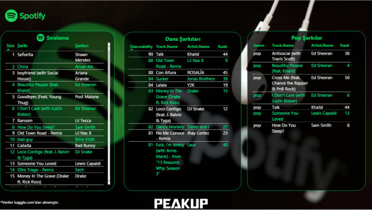
We came to the part where we move the new tables we obtained from these actions to the report. I moved the columns we filtered first, and then put the non-filtered array to the left. You can get the file here if you want.

spotify top 50 report

We analyzed the the Filter Function which is a Power BI DAX Function. We will keep analyzing other functions, various issues, dead-ends, and possibilities in other articles. Take care!

Good game well played.

Power BI – Our 2020 June Favorites

Hello there dear reader!  As much as the weather has different opinions on this subject, according to the seasons calendar they taught us in the 1st grade,  summer is here! This month even if we write about just one of the updates, it would be enough. What an update! Come on, lets start analyzing Power BI June updates right away.

Without keeping you waiting for too long, here is the superstar of the Power BI June updates:

1- Enhancements to mobile authoring

We always liked the fact that Power BI had mobile authoring. Of course it lacked some stuff. For example the squares were too big. Not being able to change the background, not being able to place, not being able to put objects on top of each other could be a bit of a pain in the neck. We got rid of all of them with just one update! Now, isn’t that amazing?

We don’t have to display expressions with low values in huge areas anymore, we can place them to an empty part of a graph. Thus we obtain a mobile layout fully matched with the design of the report. We can easily find images by their names.

There is one more thing that I am still waiting for:  Images that are not displayed on page view can be displayed on mobile layout. For example I use a slicer on page view but it is not useful on mobile layout. I need another slicer special for mobile layout. I hide these slicers or any image that I will be using behind the other graphs. I wish it was not necessary, but i do believe that it will not be in the near future. 😁

2-Automatic Page Refresh

It was a feature that made Pro users on Premium cry out “Aren’t we gonna have automatic page refresh too?” Finally it is released for Pro as well. Now Pro users too can enjoy instant refresh. To enable this feature you have to connect to a Direct Query source with this method. After that you can see this feature in page properties.

3-Enhancements to Hierarchical Slicer

In February hierarchical slicer was introduced to us. We had some issues since then, like issues with icons and font size. It is indicated that with this month’s update we got a new slicer cleared off these issues completely. Now we have more options for expand/collapse icons. Now we are able to customize indentation for child items -we had too seek it in the space back in the day as you know. Also the icons are scaled with the font size.


4-RLS is now supported for Featured Tables in Excel’s Data Types gallery

The matter of connecting to Power BI datasets from Excel is developing rapidly. Now, when you mark a table as featured and then publish to the Power BI service, that table will appear in Excel’s data types gallery even if it has RLS rules applied. Previously, these tables were not shown in Excel. This new enhancement means that users in Excel will only see the rows of data they have access to.

5-Line chart dot formatting options

Sometimes we realized that something was not quiet right, that something was missing in this line chart. But what?  We found the missing point, or shall we say the missing dot. Now we can color the dot corresponding to the related title on the X axis in the line chart. We can do it on the Data colors tab in the formatting pane.

6-Data Connectivity

Palantir Foundry Connector

Palantir Foundry is a platform that reimagines how people use data by removing the barriers between back-end data management and front-end data analysis. Foundry enables users with varying technical ability and deep subject matter expertise to work meaningfully with data. With Foundry, anyone can source, connect, and transform data into any shape they desire, then use it to take action.

This connector will soon be available in the Online services section of the Get data dialog.


You can click here to go to the download page of Power BI June updated version. And to take a look at out other articles on Power BI you can click here.


Wish you all a great month. Take care!

Good game well played.