EXCEL’S HISTORY (EXCEL FROM PAST TO TODAY)

EXCEL’S HISTORY (Excel from Past to Today)


Hello everyone,

I received a lot of questions like “Who found Excel, how was it created? It develops all the time, I wonder how the first version was…” in many of the trainings I gave in corporate companies.

As an answer to there questions, I have prepared the history of Excel and wanted to take the old users to a time travel that would make them say: “”Oh! What times…” And it will serve as an informative article for the new users.

Are you ready for the time travel? 👨🏻‍🚀


We met the first Excel as VisiCalc in 1978.
In 1978, Harvard Business School students Dan Bricklin Father of the modern Excel  had to take on an analysis task for a case study. He had two alternatives to do that:

  1. He would do it manually.
  2. He would use a simple and unskillful computer program.


He thought that he didn’t have a better alternative and chose VisiCalc in the 1978 fall.
He programmed the first study and prepared the prototype of the concept he called VisiCalc. The first version of VisiCalc was a matrix of 4 columns and 20 rows.
It was not close to the electronic tables of our day but VisiCalc was still an accomplishment for that moment.

That was the first electronic table program and was published for Apple II at first.
It had skills like basic arithmetic operations, recalculating instantly and scroll bars.


1978 – VISICALC


1980 – SUPERCALC


1982 – MULTIPLAN


1983 – LOTUS 1-2-3


1985 – MICROSOFT EXCEL 1.0 (MAC) 


1987 – MICROSOFT EXCEL 2.0 (WINDOWS)


1990 – MICROSOFT EXCEL 3.0


1992 – MICROSOFT EXCEL 4.0


1993 – MICROSOFT EXCEL 5.0


1995 – MICROSOFT EXCEL 7.0 (Excel 95)


1997 – MICROSOFT EXCEL 8.0 (Excel 97)


1999 – MICROSOFT EXCEL 9.0 (Excel 2000)

2001 – MICROSOFT EXCEL 10.0

2003 – MICROSOFT EXCEL 11.0 (Excel 2003)


2007 – MICROSOFT EXCEL 12.0 (Excel 2007) 


2010 – MICROSOFT EXCEL 14.0 (Excel 2010)


2013 – MICROSOFT EXCEL 15.0 (Excel 2013)

2016 – MICROSOFT EXCEL 16.0 (Excel 2016)

2019 – MICROSOFT EXCEL 16.0 (Excel 2019) 


2019 – MICROSOFT EXCEL 16.0 (Office 365)


Now I leave you alone with the 1992 Microsoft Excel introduction..


Well, I hope that you enjoyed this few-minute trip to the past.
You can share this post and take a few more people to the past as well. 👍🏻

Good bye.

GET RID OF DUPLICATE RECORDS WITH THE UNIQUE FUNCTION

THE UNIQUE FUNCTION


Hello everybody,

In this article I will be talking about one of the The Dynamic Array Functions -the UNIQUE function. Before this function, we had to write a long nested formula and even an array formula in order to list the unique data in one or multiple columns. But now we can list the unique data in the field you want with a single and very simple function.


WHAT DOES IT DO

The UNIQUE function allows you to create from the data in the stated field. Use this function to return a list of unique values in a list or range.  When you press Enter, the results can be displayed in a contiguous range with a suitable size.


SYNTAX

=UNIQUE(array; [by_col]; [exactly_once])

There are 3 arguments in the function.
The first one is required, the other two are optional.

Now let’s take a look at what these arguments mean, i.e. what the function wants from us and what we will give it.

Argument Description
array

Required

The range or array from which to return unique rows or columns
[by_col]

Optional

The by_col argument is a logical value indicating how to compare.

TRUE will compare columns against each other and return the unique columns

FALSE (or omitted) will compare rows against each other and return the unique rows

[exactly_once]

Optional

The exactly_once argument is a logical value that will return rows or columns that occur exactly once in the range or array. This is the database concept of unique.

TRUE will return all distinct rows or columns that occur exactly once from the range or array

FALSE (or omitted) will return all distinct rows or columns from the range or array

USE OF THE FUNCTION

We use this function to list the unique data in one column or multiple columns. For example, if we don’t know a formula to list the data in a row; we had to copy that column to a blank column and choose Remove Duplicates or we could list the Unique records only with the Advanced Filter. After writing this function, it will be enough to state the range from which we want the unique data.

You will see how easy it is one you watch the GIF below.

We have listed the unique data in the range we have stated by entering the first argument. Now let’s see what kind of results it returns with the other arguments.

The second arguments that is optional is the [by_col] argument.
TRUE and FALSE options are offered to us in this argument.
TRUE: Returns the unique columns.
FALSE: Returns the unique rows.

You can choose the FALSE option for the by_col argument if you want to get the unique data in any field.

UNIQUE / DUPLICATE DATA

The last argument [exactly_once] offers use two options concerning the data to be returned.
TRUE: Returns the data that is displayed only once. (Lists the ones that have been written only once, doesn’t take the ones written multiple times into consideration). FALSE: Returns all the different elements (Lists the unique ones in the range we choose).

We can choose the TRUE option if we want the data to be listed to be unique data only, and the FALSE option if we want the different data only.

Here is an example for that.


LONG LIVE THE NEW DYNAMIC ARRAY FUNCTIONS!


See you in other articles, bye. 🙋🏻‍♂️

You can share this post and help a lot of people get informed as well.👍🏻

SORT DATA WITH THE SORTBY FUNCTION

THE SORTBY FUNCTION

Hello everybody,

There are functions about sorting among the newly released dynamic array functions. They are:

  • SORT
  • SORTBY

We will be talking about the SORTBY function in this article.


WHAT DOES IT DO

With the SORTBY function that is one one the recently release dynamic array functions after Office 365, you can sort your table based on multiple columns/rows and sort order you want in a field without touching your table. Imagine suing the Sort feature we use a lot in Excel through the Custom Sort window. If we want to sort by multiple fields, we choose a column there and use one of the A to Z or Z to A options in the Order field and then choose the other field and choose the sorting order again. Thus, our table is sorted by the columns/rows and order we chose. Now we can do all this with one single function.


SYNAX

=SORTBY(array, by_array1, [sort_order1], [by_array2, sort_order2],…) 

There are 3 arguments in the function.
The first two are required, the others are optional.

Now let’s take a look at what these arguments mean, i.e. what the function wants from us and what we will give it.

array

Required

The array or range to sort
by_array1

Required

The array or range to sort on
[sort_order1]

Optional

The order to use for sorting. 1 for ascending, -1 for descending. Default is ascendi
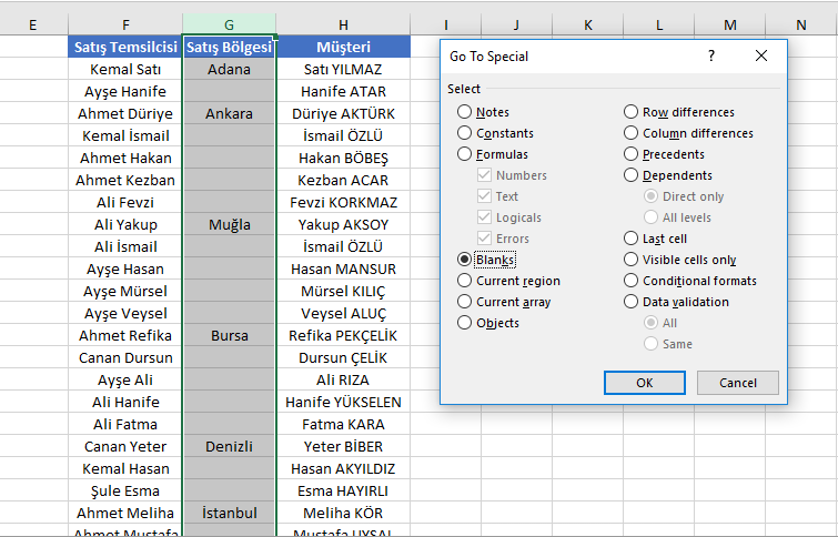
 

USE OF THE FUNCTION

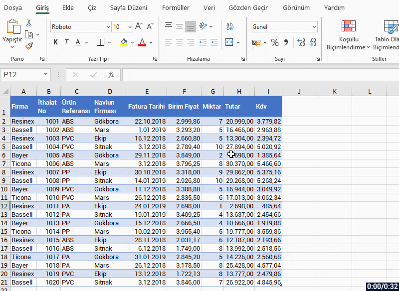
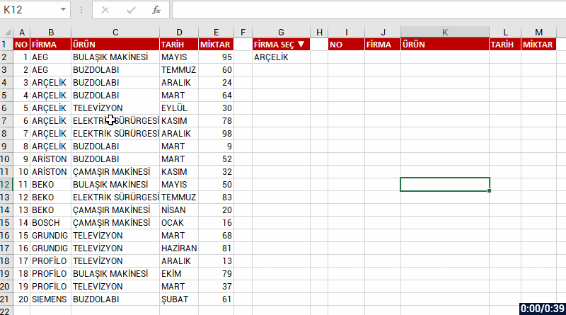
  • the data range to be listed in the array argument.
  • the data range by which the sorting will be done based on which column/row first in the by_array1 argument.
  • the sort order is chosen in the sort_order1 argument. If it is not stated, the A to Z order is accepted.
  • you can continue by choosing a data range first and then sort order in the next optional array and orders.
  • you have to state at least one column/row in the by_array1 argument.


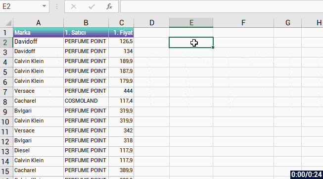
Let’s give an example and see what happens when only the optional arguments are chosen.


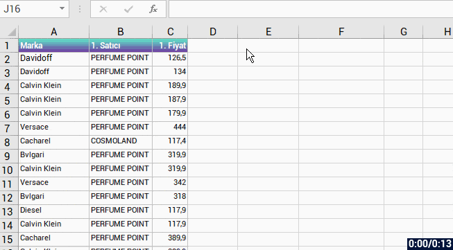
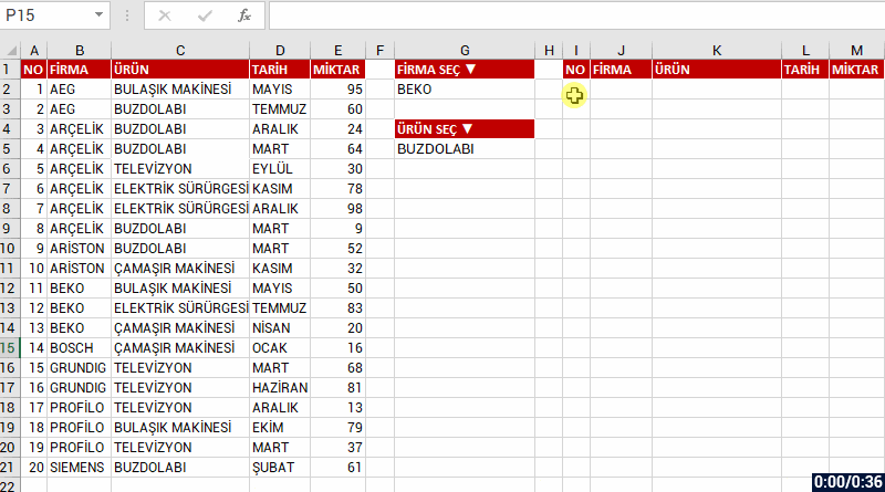
Now, let’s make the sort_order argument -1 and thus sort by Z to A .


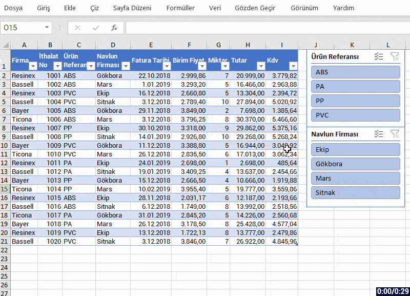
SORT BY MULTIPLE FIELDS

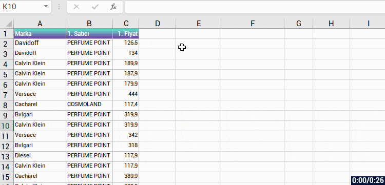
We have sorted by one column and order so far. Now it is time to sort by multiple fields and orders. 😉 Let’s sort the Marka(Brand) field A to Z and then sort the Fiyat(Price) field Z to A and then change the sorting order of the Fiyat(Price) field and see the result.


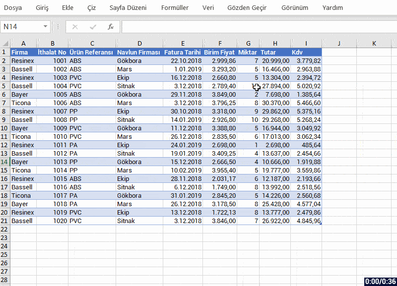
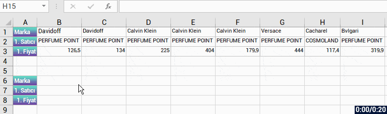
SORT FROM LEFT TO RIGHT IN A HORIZONTAL TABLE

If you wish, you can sort the data in the field you’ve stated as an array by the stated array or order from left to right in a horizontal table. The important thing is to state the array to be returned, field to be sorted and the sorting order. The table will be sorted by the criteria you stated, doesn’t matter if it is vertical or horizontal.


We will be talking about the other New Dynamic Array functions in our next articles.
And then we will be able to get things done way easier by using these new functions together. LONG LIVE THE NEW DYNAMIC ARRAY FUNCTIONS!

See you in other articles, bye. 🙋🏻‍♂️
You can share this article and help a lot of people get informed as well. 👍🏻
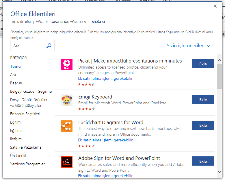
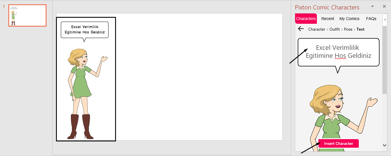
Insert Data from Picture in Excel

An amazing feature is waiting for you on your Mobile Excel.

With the Insert data from picture feature that you will use on mobile devices like cell phone or tablet, you can get data to Excel from a picture.

Insert Data from Picture

Click the button on bottom left corner to view the Excel tabs.

You will see an image with a camera on it (Data from picture).

Click the Data from picture button and take a picture of your table.

After you take the picture, your data will be arranged in the background to be transmitted to Excel.

When the actions are complete, your table will be ready.


The action is as short and fast as that..

CREATE A SPEEDOMETER CHART

SPEEDOMETER CHART


Hello everyone,

In this article, we will create a Speedometer chart. We will see how to create it simply step by step. Let me tell you this first: Microsoft will add this Speedometer chart to the standard charts for Office 365 users. I will be talking about the simplest version until then. I have stated what to do step by step below, please try to practice those steps with me. After learning how to create this chart, you can take a look at our Mouse Over Dashboard article. 😉


Let’s get started. 👍🏻


Before we start creating the chart, we have to have suitable data. We can create this chart with a few methods. We will use a combo chart in a data table to execute this action the shortest way possible.


⚫️ Let’s have this data starting from A1.

Indicator Index
25 0
35 2
40 100
100


⚫️ Choose any cell and click the Insert menu.

⚫️ Click Combo chart in the Charts group and then click Create Custom Combo Chart.

⚫️Choose the Chart Type of the Indicator as Doughnut on the Add Chart window that pops open. And choose the Chart Type of the Index as Pie and mark the Secondary Axis option, and then click OK.


⚫️ Click the + icon of the chart added to the page and unmark Chart Title and Legend.


⚫️ Right -click on the green area on the chart and then click Format Data Series. Make the Angle of the first slice 270 on the screen that opens up on right and press Enter.


⚫️ Go to Shape Fill in the Format menu and choose No Fill.


⚫️ Choose the Series “Indicator” option in the Current Selection field in the Format menu.


⚫️ Make the angle of the first slice 270 on the screen that pops open on right and then press Enter.


⚫️ We will remove the fill color of the purple piece at the bottom. For this press CTRL + (Right Key) 4 times and choose the purple Data Point and then go to Shape Fill in the Format menu and choose No Fill.


⚫️Now press CTRL + (Right Key) and choose the colors you want in the Shape Fill in the format menu for data points. If you want a bright image, you can use the Shape Effects. Note: If you click the same shape effect twice, it will become brighter.


⚫️ Choose the index only, right-click and add Data Labels. And then choose the data label and go to the formula bar, write equals to (=) and choose the B2 cell and press Enter. You can increase the font size of the data label and make it bold. The chart will look like this at this point.


⚫️If you want, you can add a Spin Button (Form Control) to the page that would make index move.

On the Developer tab, in the Controls group, click Insert, and then choose Form Controls and draw somewhere suitable in the page, for example to a blank area or a blank cell. Note: You can make the index bolder by increasing the number 2 that is indicated as the Index thickness in the cell B3.

⚫️ Right-click the form control item you’ve added and click Format Control. Go to Cell Link and choose the cell B2. And arrange the others values as the ones below.


⚫️Your Speedometer chart will be ready when you choose a circle among the Shapes and add into the middle of the chart.


Lastly, I want to share the file I have prepared with you.
You can download the file here. 👉🏻 

You can share this article and help many other people get informed as well.

Goodbye. 🙋🏻‍♂️

THE TABLE FORMAT and ITS BENEFITS

In this article, we will be talking about the benefits of the table format of the data range in Excel. When we write titles and enter data under those title or when working on a prepared file we received, we say that we have prepared a table. But the data range we call a table is not a table for Excel yet. For it to be seen as a table, you need to format the data range as a table. At that point, it allows us to use a lot of features that table format allows us.

Now let’s take a look what we need to do before creating to table to use some features and how we do them after formatting as table. By the way, it would be very helpful to write the articles on our Blog when you have a chance. If you wish, you can read a detailed article on Office Support.


Choose Style for the Table Format

We can use this feature by choosing Format as Table in the Styles group in Home tab. Choose any cell on your data and click the Format as Table command and choose the table style you want. You will have turned your data into a table quickly. Don’t forget: Everything added to the page later is an object. An image, shape, chart, table, slicer etc. all of them are objects and a menu with features of objects added later is added to the Ribbon.

You can apply this feature easily with the shortcut keys.
Choose any cell on your data and turn your data into a table with the

  • CTRL + T

shortcut.


Now, let’s see what kind of features our data range gained with such a simple shortcut.


Benefits of the Table Format

  • When you choose a cell on the table and move upwards and downwards, the column titles will be the titles of your table. Thus, you don’t need to use the Freeze Top Row feature in the Freeze Panes field in the View tab.


  • A style is applied to our table automatically and each row is colored as dark and light successively one-by-one. And this creates a nice image.


  • When you keep entering data under the table or next to the table, your table gets longer and wider. And this enables the data we enter later to be included in the table and everything to be accepted as a whole.


  • Before applying the table format, when we want to get the 18% VAT in the Sum field written to the next column; we had to write the formula into a cell and drag it down first. If there are blank rows in between, we had do drag down again. But, when we format it as a table, it is enough to write the formula and press Enter for the formula to be applied on the whole column.


  • When we turn the data into a table, a menu named Table Design or just Design is created in the Ribbon. This menu contains the features that we can use for our table. One of the most important features is the Slicer feature that we are familiar with from the Pivot Table. This feature enables us to filter the area we want on our table with one click.


  • It allows us to add functions like sum, average, count, min, max easily when we filter on the table. You can take a look at the other Table Style Options.


  • When you create a Pivot Table from the data range, you have to choose Change Data Source most of the time when new data is added outside the field specified as the range. Considering that you add new data to your table every day, you will have to choose Change Data Source and specify the new data range all the time. But, when we turn our data into a table, the data we add under it or next to it will be accepted as a part of the table and is within the data range. Thus, it will be enough to Renew for the data to be reflected on the Pivot Table.


  • In the formulas, we get to specify the data range by writing the table’s name without having to choose the whole table.


We have seen a lot of positive features till now and we obtained them with CTRL + T only.

Big or small, we recommend you to use Format as Table while working with data.
This way, you will be able to use the features above that will make you gain visualization and speed.


Convert to Range

Lastly, when you want to convert your table to data range again, you have two options.

  1.  By choosing Convert to Range in the Table Design or Design menu.
  2. By right-clicking a cell on the table and choosing Convert to Range from Table.


I hope that this was a helpful article for you.
You can share this article with your friends and help a lot of people get informed as well.

Good bye. 👍🏻


CONCATENATE vs TEXTJOIN

CONCATENATE vs TEXTJOIN


Hello everybody!

In this article, I invite you to say goodbye to the old CONCATENATE function that when we wanted to add a space or any other character while concatenating the data, obliged us to do it one by one and thus that was very laboring, and say welcome to a more efficient function. If you need to join the data in multiple cells and add characters like a space, comma, semi colon, and hyphen; there is just one function that you need to use and that is the TEXTJOIN function.


WHAT DOES IT DO 

Like I mentioned above, you don’t need to click cells one by one and use an expression like ;” “; to add a space in between each time  or a statement like & ” ” & when joining with the & character in the textjoin function. It joins each cell in the selected cell range by adding the slicer we’ve indicated. This way, we can join the data in hundreds of cells easily as a text.


SYNTAX

TEXTJOIN(delimiter, ignore_empty, text1, [text2], …)

There are 3 main arguments in the function.

These 3 main arguments are required, the other arguments are optional.Now let’s take a look at what these arguments mean, i.e. what the function wants from us and what we will give it.


delimiter
(required)
A text string, either empty, or one or more characters enclosed by double quotes, or a reference to a valid text string. If a number is supplied, it will be treated as text.
ignore_empty
(required)
If TRUE, ignores empty cells.
text1
(required)
Text item to be joined. A text string, or array of strings, such as a range of cells.
[text2, …]
(optional)

Additional text items to be joined. There can be a maximum of 252 text arguments for the text items, including text1. Each can be a text string, or array of strings, such as a range of cells.


WORKING CONDITIONS

  • If the resulting string exceeds 32767 characters (cell limit), TEXTJOIN returns the #VALUE! error.
  • It came with Microsoft Excel 2019. If you are using and older Office version, you will get the #NAME? error and thus not be able to use this function.
  • If you Office 2019 or Office 365, you can easily use this function.


USING THE FUNCTION

After we write the function name, we specify the delimeter. And then we will choose how it should behave about the possible blank cells in the cell range. And in the last arguments, we choose the cell range to be joined. Now, let’s take a look at its use together.


In the example below, we join the data between the A and G columns with a semi colon in between them.


As you see, it is as easy as that to join a multiple cell range in a single text with any character between them.


See you in another articles, bye. 🙋🏻‍♂️
You can share this post with your friends and help them get informed as well.👍🏻

PowerPoint Shortcuts: The Most Frequently Used

You can have full control during your presentation with the PowerPoint shortcuts.

Start the Presentation: F5

You can start your presentation with the F5 shortcut.

Advance to the Next Slide: N

You can use the N key to advance to the next slide.

Return to the Previous Slide: P

You can use the P key to return to the previous slide.

You can use the N and P shortcuts (Next and Previous) to switch between slides.

Return to the First Slide: 1 + Enter

You might want to return to the first slide during the presentation. In this situation, you can return without having to return one-by-one. For that you need to press 1 and then Enter.

Start the Presentation from the Current Slide: Shift+ F5

You can start your presentation from the current slide without being lost between pages with the Shift F5 shortcut.

Display the Slide You Want: Slide Number + Enter

Use Slide page number and Enter to display the slide you want during the presentation. When you go 20 Enter you can go to the 20th slide.

Group Objects: Ctrl + G 

You can group the object for them to take actions together. Choose the object and then use the CTRL G shortcut for this action.

Blackboard: B 

You can use the screen as a blackboard during the presentation. You can write with a pen on the black background and make your presentation effective.

Whiteboard: W 

You can use the screen as a whiteboard during the presentation. You can write with a pen on the white background and make your presentation effective.

Erase all the Marks: E 

You can use this to erase all the marks done with the pen and cursor.

Return to the mouse cursor after you write with the pen: Ctrl + A 

You can use this shortcut to return to the mouse cursor after you write with the pen.

Hide the Pen or Cursor: Ctrl + H 

You can use this shortcut when you don’t want to see a pen or cursor in the screen.

Show hidden pen and cursors: Ctrl + U

Enables you to bring back the cursors you have hidden.

Save the Presentation As: F12

You can use this shortcut when you want to save your presentation as different formats like PDF or video, or when you want to change its location.

Now, you are ready you present faster with the PowerPoint shortcuts!

In and Out Animations with Buttons

You can try different method to make a more effective presentation. This way, you can present in a more catchy way visually and more effectively.

The enveloped move outward when you click the mail box in the animation above.

We can start by adding images.

We choose all of the envelope items that need to move when we click the mail box. Click the Add Animation button from the Animations tab and choose More Motion Paths. We add the animation by choosing Right.

When you add the animation it will look like the image below. The road map of the animation is shown with the dotted lines. Green dots are the start of the motion and the red dots are the end of the motion.

We change the start and end motion of the animation by dragging the green and red dots.

We drag and leave the green dots (starting points) to one point in the box since we want the envelopes to move outwards from the mail box. You can leave the end points the way you want.

Now, for the envelopes to move when we click the mail box let’s choose all the envelopes and click Trigger button next to the Add Animation button and then choose the mail box image within On click of. (If you don’t know the name of this image, or if there are multiple images and you don’t know which one, you can track the items with the Home Tab- Editing-Select.)