
SPEEDOMETER CHART
Hello everyone,
In this article, we will create a Speedometer chart. We will see how to create it simply step by step. Let me tell you this first: Microsoft will add this Speedometer chart to the standard charts for Office 365 users. I will be talking about the simplest version until then. I have stated what to do step by step below, please try to practice those steps with me. After learning how to create this chart, you can take a look at our Mouse Over Dashboard article. 😉
Let’s get started. 👍🏻
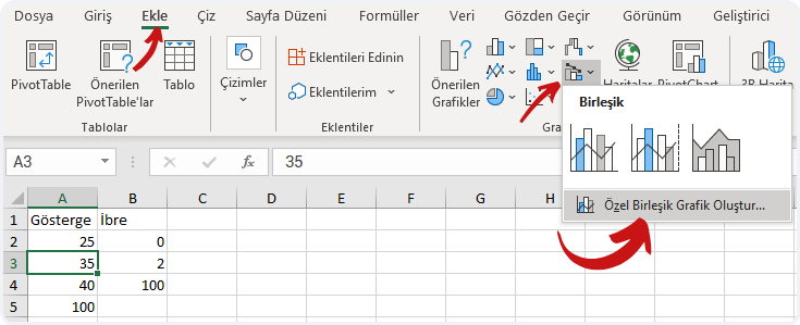
Before we start creating the chart, we have to have suitable data. We can create this chart with a few methods. We will use a combo chart in a data table to execute this action the shortest way possible.
⚫️ Let’s have this data starting from A1.
| Indicator | Index |
| 25 | 0 |
| 35 | 2 |
| 40 | 100 |
| 100 |
⚫️ Choose any cell and click the Insert menu.
⚫️ Click Combo chart in the Charts group and then click Create Custom Combo Chart.
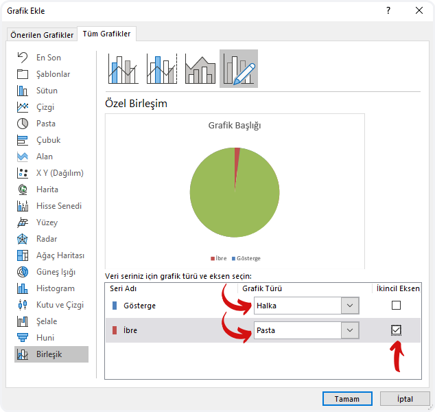
⚫️Choose the Chart Type of the Indicator as Doughnut on the Add Chart window that pops open. And choose the Chart Type of the Index as Pie and mark the Secondary Axis option, and then click OK.
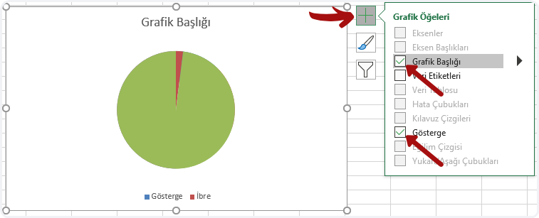
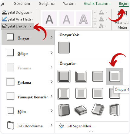
⚫️ Click the + icon of the chart added to the page and unmark Chart Title and Legend.
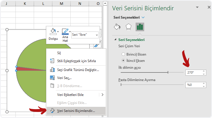
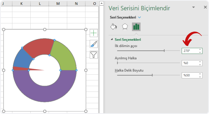
⚫️ Right -click on the green area on the chart and then click Format Data Series. Make the Angle of the first slice 270 on the screen that opens up on right and press Enter.
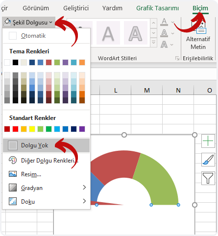
⚫️ Go to Shape Fill in the Format menu and choose No Fill.
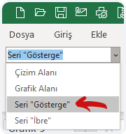
⚫️ Choose the Series “Indicator” option in the Current Selection field in the Format menu.
⚫️ Make the angle of the first slice 270 on the screen that pops open on right and then press Enter.
⚫️ We will remove the fill color of the purple piece at the bottom. For this press CTRL + ► (Right Key) 4 times and choose the purple Data Point and then go to Shape Fill in the Format menu and choose No Fill.
⚫️Now press CTRL + ► (Right Key) and choose the colors you want in the Shape Fill in the format menu for data points. If you want a bright image, you can use the Shape Effects. Note: If you click the same shape effect twice, it will become brighter.
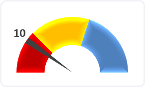
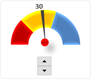
⚫️ Choose the index only, right-click and add Data Labels. And then choose the data label and go to the formula bar, write equals to (=) and choose the B2 cell and press Enter. You can increase the font size of the data label and make it bold. The chart will look like this at this point.
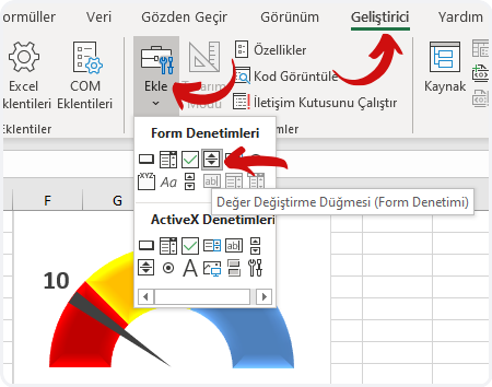
⚫️If you want, you can add a Spin Button (Form Control) to the page that would make index move.
On the Developer tab, in the Controls group, click Insert, and then choose Form Controls and draw somewhere suitable in the page, for example to a blank area or a blank cell. Note: You can make the index bolder by increasing the number 2 that is indicated as the Index thickness in the cell B3.
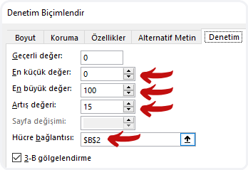
⚫️ Right-click the form control item you’ve added and click Format Control. Go to Cell Link and choose the cell B2. And arrange the others values as the ones below.
⚫️Your Speedometer chart will be ready when you choose a circle among the Shapes and add into the middle of the chart.
Lastly, I want to share the file I have prepared with you.
You can download the file here. 👉🏻 ![]()
You can share this article and help many other people get informed as well.
Goodbye. 🙋🏻♂️