Authorization with Department Control

You can enable interactive flow or do visual actions by creating rules in the application screen. Depending on the situation in the application scenario, you can connect objects or actions to department, user mail, location, title, marital status or user choice in multiple-choice actions.

Usually hide, show, freeze, open to edit or change color, location, size actions are done for the determined objects. You can apply all these controls in all application scenarios easily and flexibly.

Users whose department is HR will see the HR button that enables them to open the management and confirmation screen of HR.

It is better to do these actions step by step and in pieces while doing these controls. Like I mentioned in my previous article, the formula evaluations should be controlled in different labels and should be named depending on the outcome.

We will test the user department first in the example below.

Department Detection for the Existing User

We will use the Office365Users.MyProfile() formula that lets us get the existing login info of the user that opens the app for this action.

We will write the formula below in a label we named lbl_user_departmant and get the department information.

Office365Users.MyProfile().Department 

Is The Detected Department HR?

We will write the formula below into a label we named lbl_is_user_department_hr and check if the existing user is in the Human Resources department. If the user is in the HR, we will get the outcome as 1, if not; 0.


If the existing user is HR, what actions will be on the screen?

The Visible option of HR button will change depending on the 1/0 values that will come from the label named lbl_is_user_department_hr.

This way, the button will be showed and hidden depending on the department.

If(lbl_is_user_department_hr.Text=Value(1);true;false) 

Control Formulas

The labels named lbl_user_departmant and lbl_is_user_department_hr should be moved to the formula screen so that it is easier to revise them later. Click here to take a look at the article about creating a formula screen and its importance.

You can read about the details of the functions that are used to get user information through Office 365 here.

Similar Examples

You can do similar control with the same steps while filling a form prepared for personnel that consists of personal information like Name, Surname, ID Number, Gender, Date of Birth, Marital Status, Military Service Status.

When the gender is marked as Female, the military service status will be hidden (Visible) since it won’t be filled or it can be frozen (DisplayMode).

When the marital status is marked as single, the fields concerning spouse and children can be hidden (Visible) since they won’t be filled or they can be frozen (DisplayMode).

You can click here for other Power Apps articles.

Create an Angular Component Library w/ StoryBook

Today, we are going to create an Angular library that has a couple of components in it. Then we are going to install and configure StoryBook to see our components in action and make the development phase a little bit bearable.

I’m going to assume that you have node.js and npm package manager installed. If not, you can download node.js from here.

Create An Angular Workspace And Library

First, let’s make sure you have the “@angular/cli” package and if you don’t, install it globally;
npm install -g @angular/cli
Then we will create a workspace for our library;
ng new my-lib --create-application=false
The “my-lib” part will be your library name. We also defined a parameter to our command called “–create-application” and set it to “false”. This will give us a barebone Angular application structure without the application itself. This is the recommended way of creating an Angular workspace since Angular 7.

Then, we will create a library project inside our brand new Angular workspace. So let’s enter the project’s directory, install dependencies and create a new library;
cd my-lib
npm install
ng generate library my-lib --prefix=my

And then we are going to create a component with the command below;
ng generate component button --project=my-lib
Let’s make the component does what it says in the name;

https://gist.github.com/fatihdgn/68e78aa3acd9e9fb605af959f9c8ffa9

Alright, we created a library and added a component in it. Let’s look at how it goes, but wait…

When you want to create an Angular library that has a component aspect in it, you are going to discover that you can’t -and not supposed to actually “serve” your library and debug your components because the library is not an application that you can run. You have to have another application that has a reference to your library and use your library in there but this approach has its limits; You have to build the library and the application to see the results and it can become frustrating very easily, very fast. That’s why we are going to install StoryBook and create stories for each of our components and see them in action with hot-reload support.

Adding StoryBook To Your Workspace

We are going to initialize the StoryBook with the “sb init” command. To do this normally, we would have to install “@storybook/cli” package but since I’m going to use this occasionally, I decided to run this command using npx. You can install StoryBook CLI globally if you want to.
npx -p @storybook/cli sb init --type angular
After the installation, you’re going to have to make some changes to the tsconfig.json file in the recently created “.storybook” directory. You can find it in the root of your workspace. Replace the “extends” line with the line below, changing the “my-lib” with your project name;
"extends": "../projects/my-lib/tsconfig.lib.json",
After that, we are going to define a webpack configuration to be used from StoryBook because for some reason, it does not load the styles from the components. We will place the “webpack.config.js” file to the “.storybook” directory with the content below;

https://gist.github.com/fatihdgn/3037e8bf176f1e330964d4045832353e

Of course, we also have to install the necessary loaders;

npm install @storybook/addon-storysource --save-dev
npm install to-string-loader --save-dev
npm install css-loader --save-dev

And for the last step, remove all of the contents of the “src/stories/index.stories.ts” file with the contents below;
https://gist.github.com/fatihdgn/b293a25974282294f9a11e66a31246ba

Change the “my-lib” part to be the project name of yours, run the command below and voila!
npm run storybook

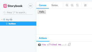
Go to the “http://localhost:6006” address from your favorite web browser and see your button component right on the page.

Create an Angular Component Library w/ StoryBook

That’s all of it. After that, you can start to develop your awesome component library.

If you have any questions, comment below and see you in the next one.


See my other articles : Cloud Wars : AWS vs Azure on Serverless