In this article, we will be talking about how to make a histogram in Excel. It looks a lot like the other bar charts, but separates your numbers into ranges the way you determine. Compared to the other chart types, histograms facilitate determining categories and frequencies of occurrence alongside different data. Don’t forget that you can take a look at our blog to see our articles about other topics. Let’s start. 👍🏻
HISTOGRAM IN EXCEL
You can find the Histogram Chart within built-in charts in Office 2016 and later version. Also, you can create a histogram in Excel with the Histogram tool. You create it by entering the numbers that represent the frequency range you want to use and the data you want to analyze. Histograms are supported by Office 365, Excel 2019, 2016, 2013, 2010, 2007 and Excel for Mac, but the steps you take depend on the Excel version you use.
Reminder: You need the Analysis ToolPak extension to use the Histogram tool in the previous versions of Excel 2016. This extension is not supported in Excel Online. But, you can display a histogram created in a desktop version of Excel by using Excel Online.
How Do You Create a Histogram Chart in Excel?
Since it is one one the built-in charts in Excel 2016 and later versions, it is pretty easy to use.
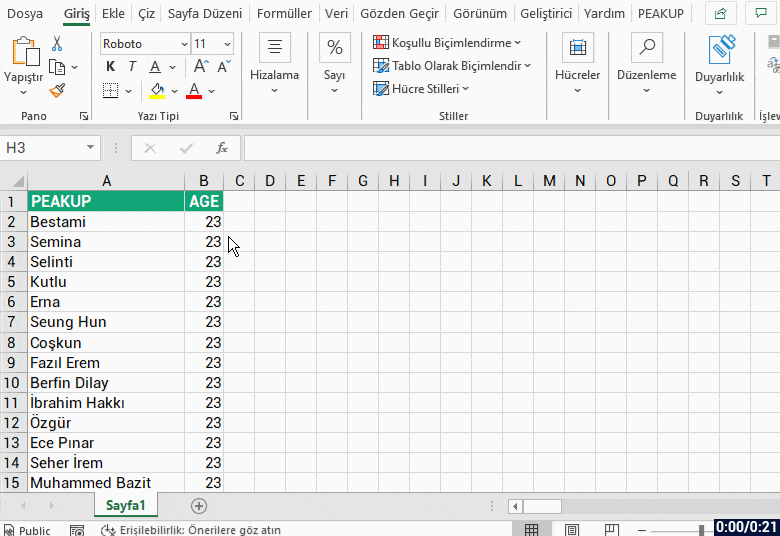
- To start, enter the data you want to use in your histogram into a worksheet. For example, enter the names of your employees in your company with 1000 workers into a column, and their ages into another column.
- Select any cell on your data table.
- Go to the Insert menu.
- Choose Insert Statistic Chart in the charts group.
- Choose Histogram chart type.
- Double-click on the horizontal axis.
- Arrange the bin width as 5.
- Add Data labels.
- Your chart is ready.
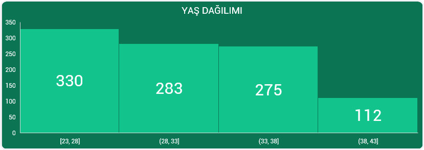
Creating a Histogram chart is as simple as that. If we want to apply the steps above, a Histogram chart like this will come up. (The colors have been edited.)
Let me show you how the steps are done with a GIF:
Creating a Histogram in Excel 2013, 2010 or 2007
Like I mentioned above, you need to active the Analysis ToolPak extension to be able to create a histogram chart in versions prior to 2016.
- Click the File menu.
- Choose Options.
- Click on Extensions.
- Push the Go button.
- Choose the Analysis ToolPak extension.
- Click on the OK button.
After following these instructions, you will see the Analysis ToolPak extension within the Analysis group on the right of the Data menu. We will show you how to activate it on the GIF below.
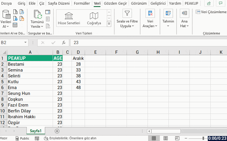
To get a Histogram from the Analysis tool, let’s write the bin width into a field first. For example; let’s write the bins starting from D2 as 28, 33, 38, 43, 48 to find how many people there are between the ages of 23 and 48 with 5 year gaps in a company with 1000 employees. You can check the GIF below for the next step.
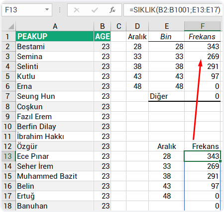
HINT: We can obtain the same Histogram that comes with data analyzes with the FREQUENCY function. We have data, and certain tracking ranges. With the FREQUENCY function, we can easily find the frequency of repetition of all values within the specified range.
You can find chart and application samples about everything I’ve mentioned in this Excel file. 👉🏻 ![]()
You can get more information on Microsoft Support.
See your in another article, good bye.🙋🏻♂️
You can share this post with your friends and help them get informed as well.👍🏻