
In this article, I will be talking about the Ideas  feature of Excel.
Explore your data in more detail with Ideas.
The Ideas button -one of the new features- explores the order within your data and offers smart and custom ideas by using that.
Ideas in Excel empowers you to understand your data through natural language queries that allow you to ask questions about your data.
Simply click a cell in a data range, and then click the Ideas button on the Home tab.
Ideas in Excel will analyze your data, and return interesting visuals about it in a task pane.
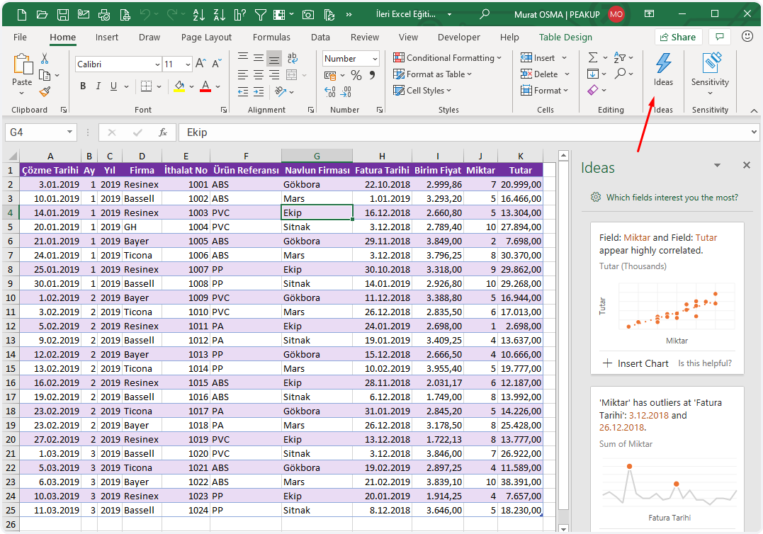
Creates dozens of artificial intelligence analysis and reports from the data in your table for you.
On which data do Ideas work?
Ideas work best when data is formatted as an Excel table with a single title row on top.
Here is an example:
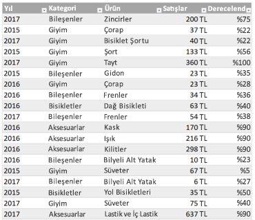
Ideas works best with clean, tabular data.
Here are some tips for getting the most out of Ideas:
- Ideas works best with data that’s formatted as an Excel Table. To create an Excel Table, click anywhere in your data and then press Ctrl+T.
- Make sure you have good headers for the columns. Headers should be a single row of unique, non-blank labels for each column. Avoid double rows of headers, merged cells, etc.
-
If you have complicated, or nested data, you can use Power Query to convert tables with cross-tabs, or multiple rows of headers.
Didn’t get Ideas?
Here are some reasons why Ideas may not work on your data:
- Ideas doesn’t currently support analyzing datasets over 1.5 million cells. There is currently no workaround for this. In the meantime, you can filter your data, then copy it to another location to run Ideas on it.
- String dates like “2017-01-01” will be analyzed as if they are text strings. As a workaround, create a new column that uses the DATE or DATEVALUE functions, and format it as a date.
- Ideas can’t analyze data when Excel is in compatibility mode (i.e. when the file is in .xls format). In the meantime, save your file as an .xlsx, .xlsm, or xslb file.
- Merged cells can also be hard to understand. If you’re trying to center data, like a report header, then as a workaround, remove all merged cells, then format the cells using Center Across Selection. Press Ctrl+1, then go to Alignment > Horizontal > Center Across Selection.
We’re always improving Ideas
Even if you don’t have any of the above conditions, we may not find a recommendation. That’s because we are looking for a specific set of insight classes, and the service doesn’t always find something. We are continually working to expand the analysis types that the service supports.
Here is the current list that is available:
-
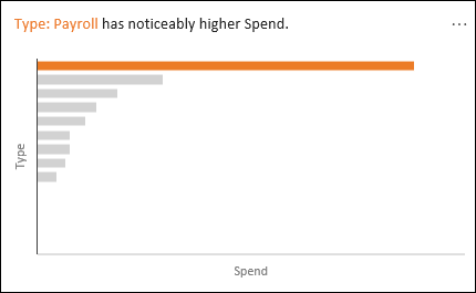
Rank: Ranks and highlights the item that is significantly larger than the rest of the items.
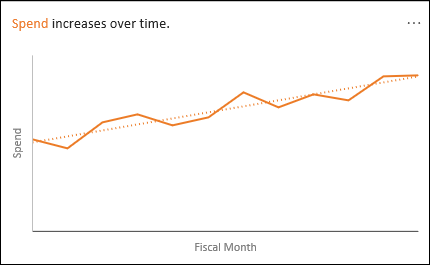
- Trend: Highlights when there is a steady trend pattern over a time series of data.
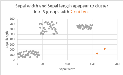
- Outlier: Highlights outliers in time series.
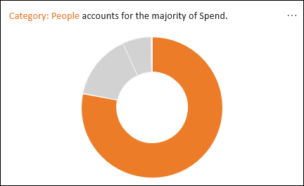
- Majority: Finds cases where a majority of a total value can be attributed to a single factor.
See you in other articles, bye. 🙋🏻♂️
You can share this post with your friends and help them get informed as well.👍🏻